Digital Agency Lingo Explained
Digital agencies, like the military, have our own (usually abbreviated) language. Before you get lost in the lingo, let’s go through a few of my favorite terms digital agency-types might throw at you.
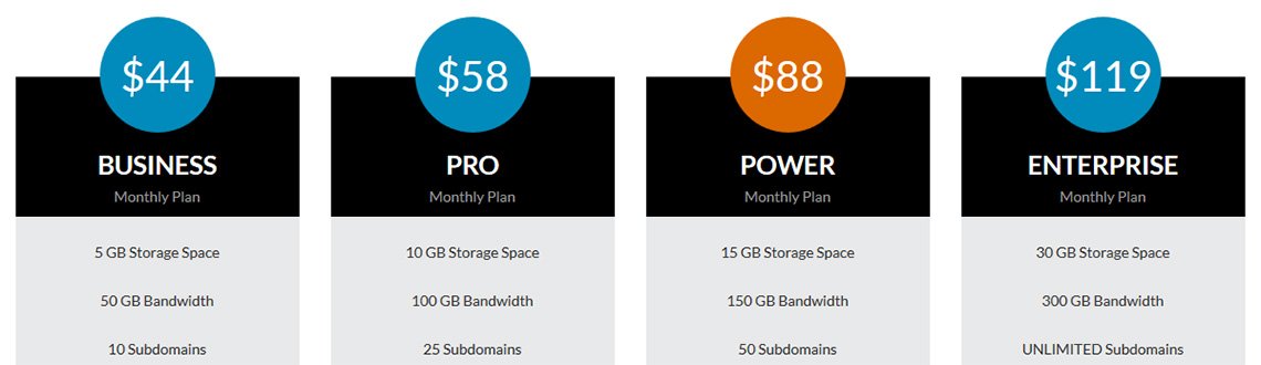
“Anchor Pricing”
Anchoring or focalism is a cognitive bias agencies may recommend as a pricing strategy. Basically, it works on the common human tendency to rely too heavily on information that surrounds what we’re interested in when making purchase decisions.
You’ll see this a lot when you see pricing tables. The most expensive pricing tier is the “anchor.” Because the buyer will want to feel like they’re getting a good deal, they won’t choose the top-of-the-line. They’ll likely choose the one that’s 1-up from the bottom or 1-down from the top.
In reality, the marketer has no intention on selling you that top-tier. It’s there purely to make the pricing for the tiers below it seem like a great deal. It’s “anchored.”
“Dynamic” / “Static”
You’ll hear developers use words like “Dynamic” or “Static” to describe elements of a website. Basically, “static” just means it’s hard-coded and cannot be changed or updated easily without doing it manually–usually by editing the HTML code in an editor.
Dynamic, on the other hand, refers to content that’s generated or automatically updated. For example, a fellow nerd might tell you, “Don’t worry. All these sidebar and footer elements are dynamic.” What they’re trying to tell you is you don’t have to manually update them. They’ll automatically update themselves–which is pretty cool and probably why they’re telling you about it at all.
“Breakpoints”
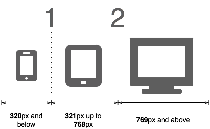 In Responsive Web Design (RWD), “breakpoints” are where we query the browser width and between certain widths (say 240px to 380px) we make changes to the style of the page. That change might be a maximum width, font size, or whatever we want. There are a few common breakpoints that work for your typical desktop, tablet landscape, tablet portrait, mobile phone landscape, and phone portrait.
However, as devices come in ever more varied dimensions, your responsive website might look great on an iPhone 6, but look a little small on the much bigger iPhone 6 Plus.
That’s when you might tell your web designer, “We might need another breakpoint to account for iPhone 6 Plus displays” and you’ll sound like a RWD pro.
“GUI”
GUI (pronounced “gooey”) stands for Graphic User Interface. Many web designers will use GUI and UI (or User Interface) interchangeably. These are actually two different things, but they’re probably meaning them to be the same thing.
The GUI is the “pretty” part of your web application. There’s a lot of beautiful code behind the scenes, but this is the only part a user actually gets to see and interact with. It’s important. You could have the most stunning code powering your application, but if the GUI is confusing, slow-loading, or just plain ugly, people will hate it.
“Wetware”
Super-nerds divide the world into two types of problems: hardware and software, but there’s a third: Wetware. No matter how much time you spent on the backend or how beautiful and easy-to-use your front-end seems, user experience testing (or “UX testing”) might indicate that people are just beyond confused. You’ve got a “wetware” problem.
“Call-back”
This one has nothing to do with phones. A “call-back” is a term borrowed from comedy writers used to describe referring again and again to the punchline of a previous joke. In advertising, we’ll sometimes use it at the very end of an ad to drive home our point and cement it in the viewer’s mind.
Keep your eyes peeled and I’ll bet you’ll see this done in TV ads. The plot is always the same.
- Set the stage (called ‘laying pipe’).
- Joke happens.
- Explaining and asking for the sale (called a “Call-to-Action”).
- Show the logo (for branding reasons).
- Then, a super-fast reference to that joke again.
- Cut.
“Vanity Metrics”
This one agency-types might not say to your face, but they’ll say it behind your back. “Metrics”, in general, refer to measurements made and included in various “how we’re doing” reports. “Vanity Metrics”, specifically, refer to metrics included in these reports that don’t really matter but make people feel warm and fuzzy.

Start-ups are usually the worse offenders, but we’re all a little guilty of this now and again. Unfortunately, vanity metrics have a habit of always catching up with us eventually. Honestly, how long did you think you could sustain 400% growth?!
Example REAL Metrics:
- Engagement
- Unique Visitors
- Qualified Leads per Month
- Traffic Source Distribution
- Active Users
Example “Vanity” Metrics:
- Raw Number of Pageviews (because it’s usually a big number)
- Email Open Rates
- Tweets per Day
- Number of Downloads
- Growth Percentages (Up 5000%!)
If you’re a little confused about the difference, check out the TechCrunch article, “Don’t be fooled by Vanity Metrics.”
“Purple Dolphins”
My favorite. I once had a designer colleague who insisted on inserting purple dolphins into his early-stage designs to show to clients. I eventually had to ask him, “what’s with the dolphins?” His response:
“Clients feel they NEED to make changes, but they can never agree on what changes should be made. By introducing something I know they’ll all hate, everyone can agree they hate the purple dolphin and want it removed. Thus, they feel they’ve done their job and made a change–even if it’s the one I wanted them to make.”
We don’t use purple dolphins in our designs, but it’s something you might hear us refer to and think it’s an inside joke. Maybe it is…

Justin Downey
Justin Downey is Founder and President of JDM Digital. He's a closet nerd, loves craft beer, and is a poor (but improving) golfer.
Get the Email
Join 1000+ other subscribers. Only 1 digest email per month. We'll never share your address. Unsubscribe anytime. It won't hurt our feelings (much).