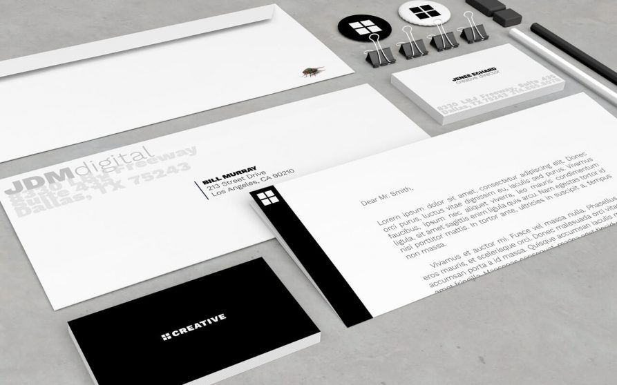
Brand standards are a set of guidelines for the colors; photography and graphic elements; logo specs; fonts and messaging that comprise your brand. They’re the glue that holds your Brand together and help to create and protect your firm’s brand identity.
All these brand standards are housed in a “Brand Standards Document,” sometimes referred to as a “Brand Standards Manual” or “Style Guide.”
Whatever you want to call it, this document holds the “rules” to how your Brand will be see across a wide variety of media. The best Brands stick in our minds because their presence is defined by the repetition and consistency of the same logo, fonts, colors, and images. That’s why this is such an important document.
Elements of Brand Standards
Picture the most recognizable brands you can think of. You’ve learned to recognize them because of the consistency. The same brand colors are reflected across them. The language sounds familiar. It’s all very organized and, while not rigid, it IS cohesive.
Here are a few elements that should be included in a Brand Standards Document.
Color Palette
A color palette is a group of colors a company uses to design its brand, and it guides every piece of visual content the brand creates. Your color palette can be as simple or as elaborate as you want, so long as your brand doesn’t deviate from the colors you choose to include.
Tone
The “voice” of the Brand needs to be consistent. Is it conversational or formal? Does it use formal editorial styles (AP, MLS) or less? How does it refer to itself? All these questions and more need to be answered so no matter who the copywriter is, the Brand’s “voice” remains the same.
Typography
Typography is another visual element of your brand style guide, but it isn’t just the font you use in your company logo. Typographic guidelines can support your blog design — which font you publish articles in — the links and copy on your website, and even a tagline to go with your company logo.
Logo Rules
How your logo is displayed, altered, or laid-out matters. Some brands are more particular than others, but all brands need to keep the orientation or variations consistent.
Brand Standards Examples
Heard enough? Let’s take a look at a few examples.
Medium
Medium emphasizes both typography and color in its brand style guide. Its guide also include details related to the company’s “Purpose” and “Product Principles.” You’ll find the full Brand Standards guide here.
Skype
The video chat platform also has a squeaky-clean style guide for its brand. Skype, owned by Microsoft, focuses primarily on its product phrasing and logo placement. You’ll find the full Brand Standards guide here.
Spotify
Spotify’s style guide might appear simple and green, but there’s more to the brand than just a lime green circle. Spotify’s color palette includes three color codes, while the rest of the company’s branding guidelines focus heavily on logo variation and album artwork. The style guide even allows you to download an icon version of its logo, making it easier to represent the company without manually recreating it.
You’ll find the full Brand Standards guide here.
AT&T
AT&T has gone through a number of rebrands over the years, usually because of aquisitions. Their 33-page Brand Standards Document is very specific and very rigid. You can download it from here.
