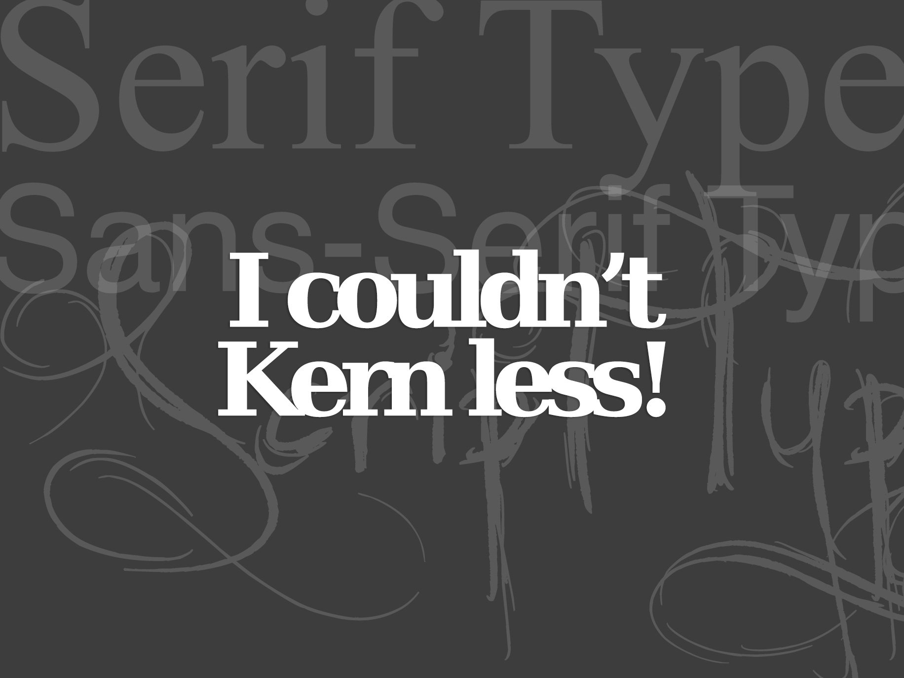
Choosing Web Design Typography
It can be overwhelming, but stick to what really matters.
When it comes to selecting the perfect web font for your new web design, the choices can be overwhelming. Let’s look at a few things that really matter when choosing the perfect web design typography: compatibility, load time, and design purpose.
Before we get into the three main factors that influence web typography, let’s refresh our understanding of the fundamentals.
Serif vs. Sans Serif
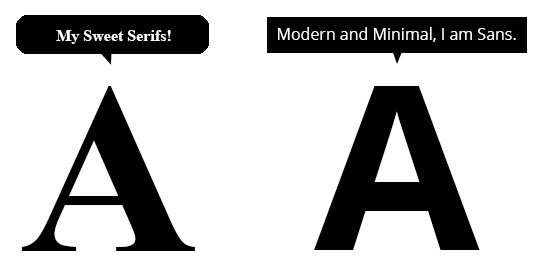
Serifs are the small, decorative lines trailing from the edges of letters and symbols reminiscent of the days of typewriters and typesetters. Even today, serif fonts are often considered easier to read in printed works. Sans-serif, as the name implies, is a typeface without all those projecting features at the end of the strokes.
Sans-serif fonts tend to look more modern and minimal than their traditional counterparts. Many also consider Sans-serif as the way to go for web-based applications. Today, Sans Serif is the dominant typography for web design.
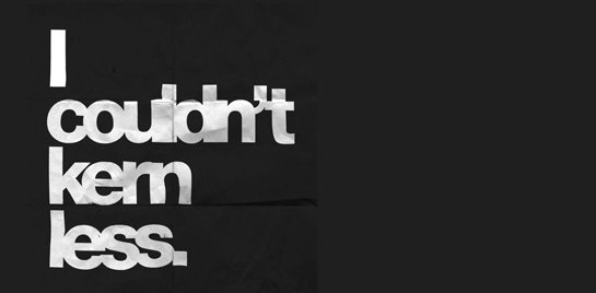
Kerning, Tracking and Leading
These typography-nerd terms all refer to the amount of space surrounding text–which is just as important as the typeface of that text. Kerning is the space between letter pairs; while “tracking” is the uneven space between groups of characters usually used for justifying paragraphs.
“Leading” is the amount of space between lines of text–though most refer to it now as “line height.” In fact, the CSS property for Leading is line-height:1;.
Contrast
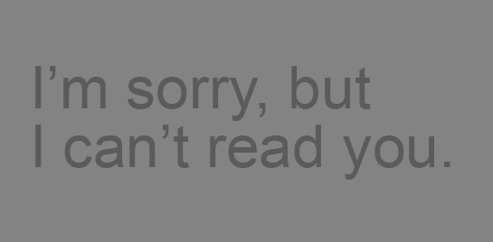
By contrast, we’re referring to the difference in color between the fine-lined typeface and the background on which it sits.
We often see low-quality designs that forget this fundamental of web design typography and place dark gray text on a lighter gray background.
Hope that little refresher helps. Now, let’s get to the three factors that really matter when choosing a web font.
Compatibility
One of the things that makes web typography difficult is that browsers are always changing and getting updates. You’ll want to select a typeface that is compatible with modern web interfaces used on both desktop and mobile devices. Sounds easy, right? It may take testing across multiple devices to find something that works seamlessly.
That leads most designers to choose a web font over an OS font. The most popular, partly because it’s free, is Google Fonts. There ARE others out there, but Google Fonts are a great place to start.
NOTE: Many Google Fonts look terrible when they’re printed. If the project is web-only, you’re golden. If you plan on using the same font for print applications as well, beware.
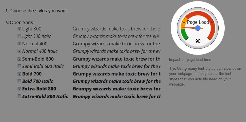
Load Time
So you’ve decided to go with a Google Font. That’s great, but don’t go crazy with too many fonts and font stacks. Remember, your browser has to reach out to Google to load each and every font–even if you’re not using it yet.
There’s a handy load type chart Google provides when you’re setting up your HTML for inclusion in your project, but it’s not as accurate as you might think. Some fonts have many more characters included than others and can quickly increase the weight of your web page by 50 to 100KB if you’re not careful.
Design Purpose
Start with the type. Sometimes font selection comes almost as an afterthought; things will come together easier if you determine type options first. Then think about how the text will play in with other design elements such as color and images. When choosing more than one typeface, consider if these two or more fonts would be seen at the same party.
Lato and Arial do NOT hang out with the same people at the same parties.
There are so many typefaces available, choosing just one is enough to make your brain bleed. Cut through the clutter by filtering by Serif or Sans-Serif. Then, start by looking at the most popular typefaces and working your way down to the more unusual. Popular typefaces are popular for a reason. They’re beautiful.
Lastly, consider the tone. It’s vital to ensure the typeface matches the tone and messaging of the project. of the project you are working on. Ask yourself:
- Is the project formal or casual?
- Should text be bold or lighter?
- Is the typeface for large text or small?
- How will it pair with color or images?
- Does the mood of lettering match the words being read?
Well, that’s a start. Typography is an art unto itself, but we hope we’ve given you a little (art) direction.
There’s a big beautiful world of web typography out there. Seize it!

Jenee Echard
My 3-year-old is a smartass, just like me. I’m a sucker for banjos, harmonicas and ukuleles. I am painfully shy, so I can come off as snobby. I love my work. I enjoy being challenged.
Get the Email
Join 1000+ other subscribers. Only 1 digest email per month. We'll never share your address. Unsubscribe anytime. It won't hurt our feelings (much).