The Divi Builder
Divi is best used in visual mode, allowing you to build your page on the front-end of your website.
Part of the Divi Theme Framework, the Divi Builder comes in two forms: The standard “Back-end Builder” and the front-end “Visual Builder.” Both interfaces allow you to build exactly the same types of websites with the same content elements and design settings. The only difference is the interface. The Back-end Builder lives inside of the WordPress Dashboard and it can be accessed along with all of the other standard WordPress settings. It sits inside the WordPress UI and replaces the standard WordPress post editor. It’s great for making quick changes while you are inside the dashboard, but it’s also confined by the dashboard and is rendered as a block-based representation of your website. This tutorial will be focusing only on the visual builder.
Builder Basics
The builder uses three main building blocks: Sections, Rows and Modules. Using these in unison allows you to create a countless array of page layouts. Sections are the largest building blocks, and they house groups of rows. Rows sit inside of sections and are used to house modules. Modules are placed inside of rows.
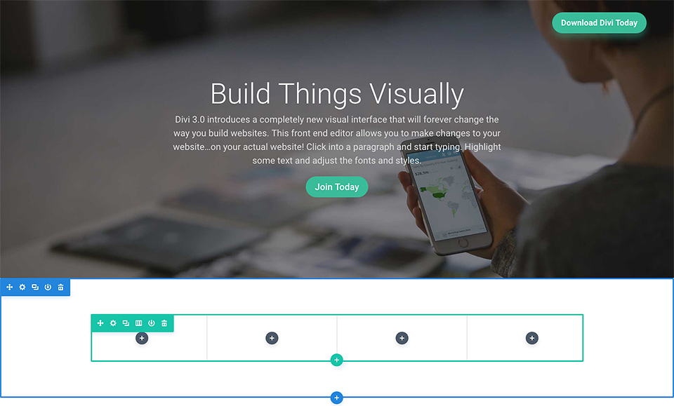
Sections
The most basic and largest building blocks used in designing layouts with Divi are sections. These are used to create large groups of content, and they are the first thing you add to your page. There are three types of sections: Regular, Specialty and Full Width. Regular sections are made up of rows of columns while Full Width Sections are made up of full width modules that expand the entire width of the screen. Specialty sections allow for more advanced sidebar layouts. For more information about using sections, head over to their in-depth sections tutorial.
Rows
Rows sit inside of sections and you can place any number of rows inside a section. There are many different column types to choose from. Once you define a column structure for your row, you can then place modules into a desired column. There is no limit to the number of modules you can place within a column. For more information about using rows, head over to their in-depth rows tutorial.
Modules
Modules are the content elements that make up your website. Every module that Divi has can fit into any column width and they are all fully responsive.
More Documentation
You’ll find even more documentation on the author’s website.
Get Support
Nobody's perfect. If you need a little help, request support from the super-nerds at JDM Digital.
Any information you provide here will be kept confidential and only used for this purpose.