Bootstrap 3 Secondary Dropdown Menu
Bootstrap 3 navbars don’t support secondary dropdowns naively, but we can certainly make them. Better yet, we can even make it work for the WordPress menu system.
Secondary dropdowns in traditional menu systems are super-handy. The responsive Bootstrap grid system is perhaps one of the most popular out there. But there’s a catch. Bootstrap 3 navbars don’t support secondary dropdowns naively. However, we can certainly make them. Better yet, we can even make it work for the WordPress menu system by making a small edit to the wp_bootstrap_nav_walker class. Here’s how to implement Bootstrap 3 secondary dropdowns and then make them work with WordPress.
Multi-Level Dropdowns
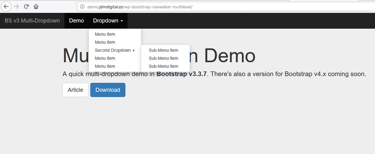
Here’s the goal. We want Bootstrap to support secondary or multi-level dropdowns. By that we mean, a dropdown inside a dropdown like so:
- About
- Dropdown Menu Item
- Secondary Dropdown Menu Item
- Secondary Dropdown Menu Item
- Dropdown Menu Item
- Dropdown Menu Item
- Contact
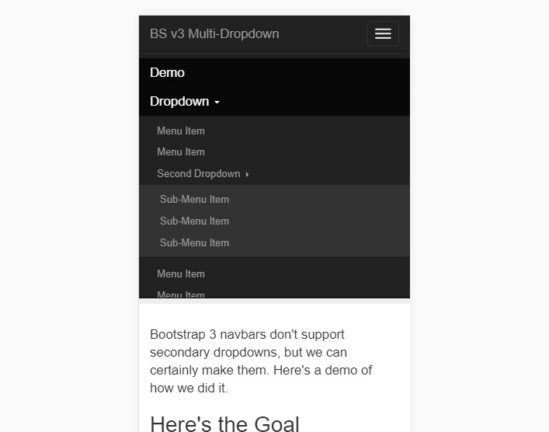
Sounds easy enough, but a Google search for “Bootstrap 3 Multilevel dropdowns” turns up all sorts of posts with people asking if this is possible and responders saying it isn’t. Well, it IS–no matter what you read online. Here’s what we’ll be creating if you were viewing it on a mobile device.
The HTML
Let’s start out with some static HTML markup. Here’s what our goal might look like in default Bootstrap v3 navbar menu markup.
<nav class="navbar navbar-inverse navbar-fixed-top">
  <div class="container-fluid">
    <div class="navbar-header">
        <button type="button" class="navbar-toggle collapsed" data-toggle="collapse" data-target="#bs-navbar-collapse-1" aria-expanded="false">
            <span class="sr-only">Toggle navigation</span>
            <span class="icon-bar"></span>
            <span class="icon-bar"></span>
            <span class="icon-bar"></span>
        </button>
        <a class="navbar-brand" href="#">Brand</a>
    </div>
    <div class="collapse navbar-collapse" id="bs-navbar-collapse-1">
        <ul class="nav navbar-nav">
            <li><a href="index.php">Home</a></li>
            <li class="dropdown">
                <a href="#" class="dropdown-toggle" data-toggle="dropdown" role="button" aria-haspopup="true" aria-expanded="false">Dropdown <span class="caret"></span></a>
                <ul class="dropdown-menu">
                     <li><a href="#">Menu Item</a></li>
                     <li><a href="#">Menu Item</a></li>
                     <li class="dropdown-submenu">
                         <a tabindex="-1" href="#" class="dropdown-submenu-toggle">Second Dropdown <b class="caret"></b></a>
                         <ul class="dropdown-menu">
                             <li><a href="#">Sub-Menu Item</a></li>
                             <li><a href="#">Sub-Menu Item</a></li>
                             <li><a href="#">Sub-Menu Item</a></li>
                         </ul>
                     </li>
                     <li><a href="#">Menu Item</a></li>
                     <li><a href="#">Menu Item</a></li>
                 </ul>
             </li>
         </ul>
     </div><!-- /.navbar-collapse -->
  </div><!-- /container -->
</nav>
The CSS
We’re going to let CSS do most of the heavy lifting and use as many native Bootstrap classes as we can. That way, we’re not over-customizing what’s already been done for us.
/* NEW 2nd-Level Dropdown CSS START */
.dropdown-submenu{position: relative;}
.dropdown-submenu .caret{-webkit-transform: rotate(-90deg); transform: rotate(-90deg);}
.dropdown-submenu > .dropdown-menu {top:0; left:100%; margin-top:-6px; margin-left:-1px;}
.dropdown-submenu.open > a:after{border-left-color:#fff;}
.dropdown-submenu.open > .dropdown-menu, .dropdown-submenu.open > .dropdown-menu {display: block;}
.dropdown-submenu .dropdown-menu{margin-bottom: 8px;}
.navbar-default .navbar-nav .open .dropdown-menu .dropdown-submenu ul{background-color: #f6f6f6;}
.navbar-inverse .navbar-nav .open .dropdown-menu .dropdown-submenu ul{background-color:#333;}
.navbar .navbar-nav .open .dropdown-submenu .dropdown-menu > li > a{padding-left: 30px;}
@media screen and (min-width:992px){
    .dropdown-submenu .dropdown-menu{margin-bottom: 2px;}
    .navbar .navbar-nav .open .dropdown-submenu .dropdown-menu > li > a{padding-left: 25px;}
    .navbar-default .navbar-nav .open .dropdown-menu .dropdown-submenu ul{background-color:#fff;}
    .navbar-inverse .navbar-nav .open .dropdown-menu .dropdown-submenu ul{background-color:#fff;}
}
/* NEW 2nd-Level Dropdown CSS END */
The JS
The CSS takes us 99% of the way toward our goal, but we still need a little Javascript to take us across the finish line. Since Bootstrap already requires jQuery be loaded, the following is written using jQuery.
// Make Dropdown Submenus possible
$('.dropdown-submenu a.dropdown-submenu-toggle').on("click", function(e){
    $('.dropdown-submenu ul').removeAttr('style');
    $(this).next('ul').toggle();
    e.stopPropagation();
    e.preventDefault();
});
// Clear Submenu Dropdowns on hidden event
$('#bs-navbar-collapse-1').on('hidden.bs.dropdown', function () {
  	$('.navbar-nav .dropdown-submenu ul.dropdown-menu').removeAttr('style');
});
What About Hover for the Dropdown?
That’s a fair question. You might be used to seeing dropdown menus work on mouse hover, but this one only show/hides on click. What gives? Well, it’s mobile-first and there is no “hover” state on a touchscreen device. Don’t care? That’s cool. Let’s see if we can add support for secondary dropdown menus on hover.
We could use CSS and add the :hover state, except Bootstrap uses an “open” class and some other JavaScript to power these menus and we don’t really want to rewrite all their stuff. Instead, let’s go with the flow and toggle that “open” class both for their dropdown toggle and our new dropdown submenu toggle. Here’s the updated Javascript.
// Make Dropdown Submenus possible
$( document ).ready(function() {

   // Make Secondary Dropdown on Click
   $('.dropdown-submenu a.dropdown-submenu-toggle').on("click", function(e){
      $('.dropdown-submenu ul').removeAttr('style');
      $(this).next('ul').toggle();
      e.stopPropagation();
      e.preventDefault();
   });

   // Make Secondary Dropdown on Hover
   $('.dropdown-submenu a.dropdown-submenu-toggle').hover(function(){
      $('.dropdown-submenu ul').removeAttr('style');
      $(this).next('ul').toggle();
   });

   // Make Regular Dropdowns work on Hover too
   $('.dropdown a.dropdown-toggle').hover(function(){
      $('.navbar-nav .dropdown').removeClass('open');
      $(this).parent().addClass('open');
   });

   // Clear secondary dropdowns on.Hidden
   $('#bs-navbar-collapse-1').on('hidden.bs.dropdown', function () {
      $('.navbar-nav .dropdown-submenu ul.dropdown-menu').removeAttr('style');
   });

});
WordPress Walker Function
wp-bootstrap-navwalker, is a custom WordPress nav walker class by WP Bootstrap to fully implement the Twitter Bootstrap 3.0+ navigation style (there’s a branch for Bootstrap v4 too) in a custom theme using the WordPress built in menu manager.
The GitHub README has very detailed instructions for implementing this, so I’ll skip that part. The only problem with the function is that it doesn’t support multi-level dropdowns. Well, that’s exactly what we’re going to “fork and fix.”
You’ll find our fork of this awesome walker function on JDM Digital’s GitHub Page. We also include a version of the PHP function if you download the live demo.
Seeing is Believing
Want to see it in action? Sure. Check out the live demo. You can download the source files, including the updated wp-bootstrap-navwalker.php walker function too.
A version for Bootstrap 4 is coming soon. Stay tuned to our Insights blog for the latest.
So, there you go. Bootstrap 3 doesn’t support secondary dropdowns, but you CAN make it.
UPDATE: Our code now includes support for secondary dropdowns on hover, not just click/tap. Thanks, Marcos, for the suggestion. You can download the latest demo code here.

Justin Downey
Justin Downey is Founder and President of JDM Digital. He's a closet nerd, loves craft beer, and is a poor (but improving) golfer.
Get the Email
Join 1000+ other subscribers. Only 1 digest email per month. We'll never share your address. Unsubscribe anytime. It won't hurt our feelings (much).
Discussion
Comments are now closed.