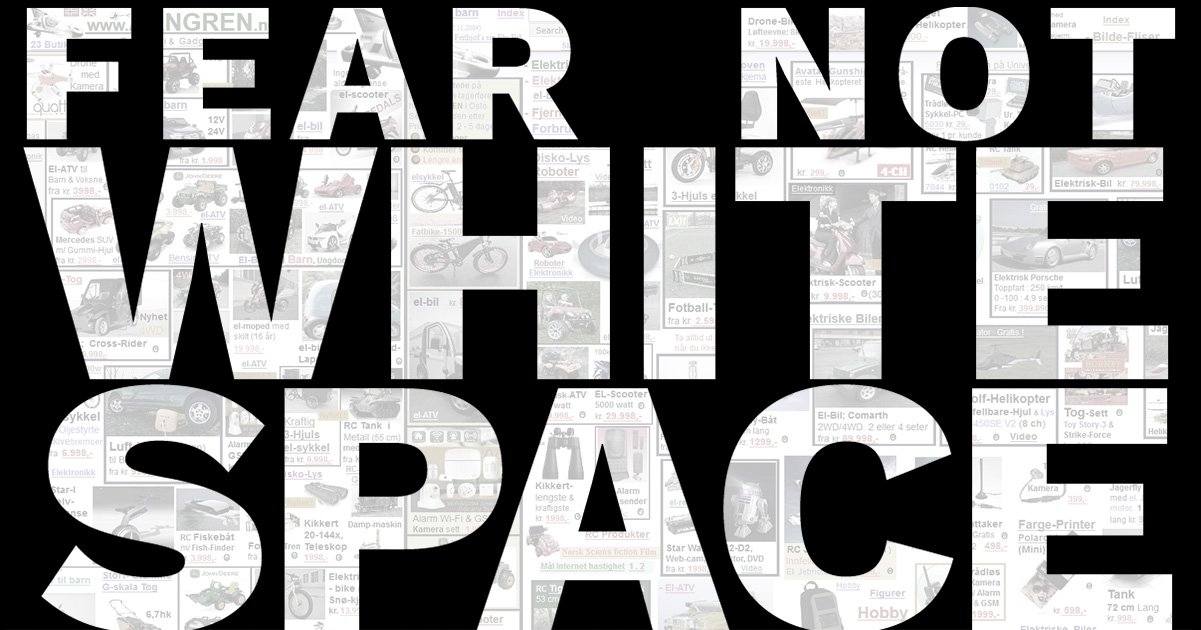
Fear Not White Space
It's not uncommon for clients to tell designers, "There is just too much white space." That is unlikely. Maybe you fear white space.
Have you ever seen the Oatmeal comic, “How a Web Design Goes Straight to Hell?” It’s the one where a wide-eyed designer starts off excited about the website redesign. Slowly but surely the client requests small changes to the design until it all goes to hell.
These changes are things like “Can you make it pop?”, “Make the logo bigger,” and “I don’t like blue.” All these statements speed up the process of a design going to hell, but the one we should be more aware of is, “There is too much white space.” That one is a precursor to design disaster.
“White space is to be regarded as an active element, not a passive background.”
– Jan Tschichold
Young designers may roll their eyes or curse under their breath when they hear something about too little white space. But as web designers, it is our job to help our clients realize why that white space is an important part of web design and user experience (UX).
Do you fear white space?
 Mario Praz, an Italian born critic of art and literature, coined the term “Horror Vacui” (Latin for “Fear of empty space”) to call out the cluttered art of the Victorian era.
At the time, having more, meant affluence. So every square inch was packed with “stuff.”
Today, the term has become as ubiquitous in the fields of interior design, print design, and digital design, as “the fold.”
What is white space?
White space, also known as negative space, is a fundamental element in design. Whitespace isn’t necessarily the color white. Any color can be used. White space is a tool designers use to carefully layout content and craft their message. It is the space between the content, lines of text, graphics, figures, icons, and objects.
Types of white space
- Micro white space – The space between lines of text and within grids, etc. This white space helps legibility and readability of content.
- Macro white space – The white space between major elements on a page. For example, the left and right margins on this page
Importance of white space
- It improves readability
- It adds emphasis
- It clarifies relationships
- It implies a rhythm
How to use white space
Until now, we’ve only looked at defining white space and told you it’s important. Let’s put it to good use (using some examples).
White space on the Home Page
Let’s look at Dropbox’s home page. Website visitors come here looking for specific information. We don’t want to add too much non-essential information here as that would distract them from why they’re here.
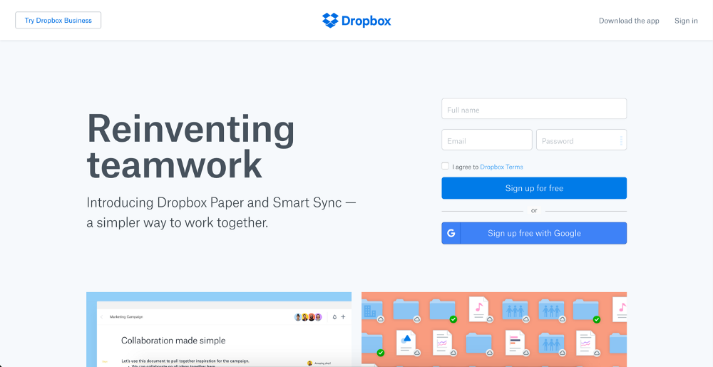
Credit: Dropbox
There is a concept called Hick’s Law that states the more options presented to the user, the more time it will take to make a decision.
White Space on a Product Page
Let’s take a look at a product page from Apple. The goal of this page is to increase sales of the product. Visitors prefer simple over the complex. The design should present content and images that will demonstrate the usefulness of the product quickly and in as easy-to-understand way as possible.
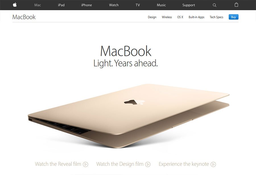
Credit: Apple, Inc.
There’s a philosophical idea called Occam’s Razor which says that among competing ideas, the simplest one should be selected. A product page with a lot of white space is an application of this idea.
White space on a Dashboard
The goal of a typical dashboard is to provide critical information to the user so they can quickly take appropriate actions.
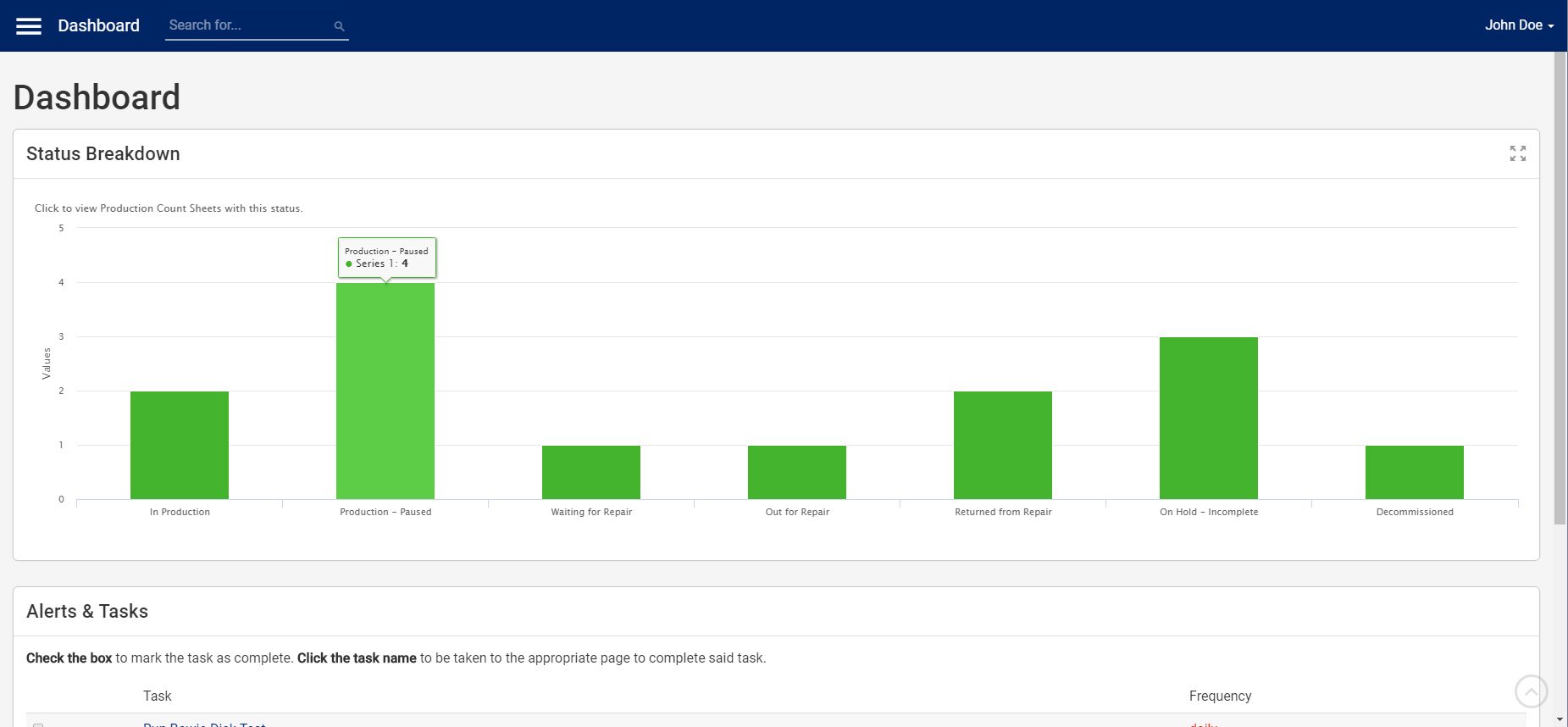
Credit: SPD Track.
Users want the information that is most relevant for them to complete their tasks. Stuffing that dashboard with extraneous content (noise) will reduce the effectiveness of the dashboard as a whole.
Consider the concept of a Signal-to-Noise ratio. If we reduce as much unnecessary information (less noise), we can make the essential information (the signal) clearly visible and understandable.
White space on a Form
Let’s say you have a sign-up form. The goal here is to help users provide the minimum required information to sign up for your product or service. People want to use your product as soon as possible and not feel overwhelmed by all the extra fields.
Also, using the right micro white space builds vertical rhythm. How do people fill in a login form? Username, Password <beat> “Remember Me” checkbox <beat> login/submit.
By adding a little extra vertical white space between the login elements the user will naturally want to pause between, makes the design, itself, follow that same rhythm and the result feels very intuitive.
###
Designers gotta educate
There are some wonderful examples of how to respond to your client when they say “There is just too much white space” in a Medium post by Rizwan Javaid titled “Horror Vacui – The Fear of White Space.”
I highly recommend my fellow web designers take the time to give it a read.

Justin Downey
Justin Downey is Founder and President of JDM Digital. He's a closet nerd, loves craft beer, and is a poor (but improving) golfer.
Get the Email
Join 1000+ other subscribers. Only 1 digest email per month. We'll never share your address. Unsubscribe anytime. It won't hurt our feelings (much).