Great Interactive Infographic Examples
Your typical, static information graphic or “infographic” is a long scrolling image that quickly and visually represents complex information, data or knowledge. Infographics aren’t all that new. Interactive Infographics, however, take this visual storytelling in a much more immersive direction.
JDM Digital has been designing static infographics from some time and has recently started producing Interactive Infographics. Here are a few of our favorite Interactive Infographics–not all of them produced by us.
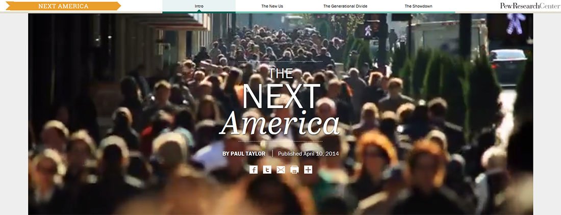
The Next America – Pew Research Center

To accompany their new book by the same name, The Pew Research Center draws on their extensive research to paint a data-rich portrait of the many ways our nation is changing and the challenges we face in the decades ahead.
The interactive inforgraphic is filled with interesting information, snazzy animated charts, and an interesting “boxed, but not really” layout.
View the Pew Interactive Infographic
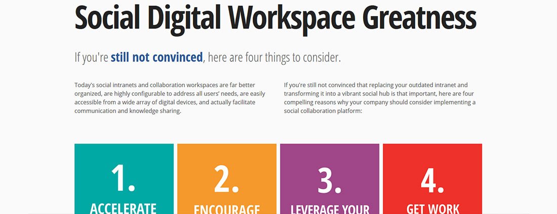
Why Your Intranet Needs to Go Social – SocialText

SocialText takes a close look at those traditional, static, disorganized intranets and makes a compelling case for why they are quickly becoming a relic of portals past.
The infographic sports some cool animations (courtesy of Animate.css and Wow.js), ajax loading of additional content, and wraps it all in a mobile-friendly responsive framework.
View the SocialText interactive infographic
What HR Buyers Say (and What it Means to You) – HRmarketer

Based on a recent survey of nearly 200 HR and talent management buyers, HRmarketer and fisher VISTA released this interactive infographic to build awareness for their graphic filled, 12-page The 2014 HR Buying Trends Report.
View the HR Buyer Trends Infographic
Consumer Tech Trends and Their Impact on Enterprise HCM Software – Starr Conspiracy

The Starr Conspiracy released this parallax-based scrolling infographic to accompany the release of their whitepaper, “The Future of HCM: 7 Trends That Every HCM Provider Needs to Know.”
Using a combination of scrollTo, parallax, and hover events, the interactive infographic walks readers though the challenges in an informal, but still informational way.
View the interactive infographic
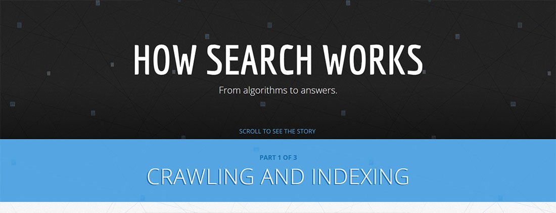
How Search Works – Google

Leave it to the team at Google to show us how it’s done. Google’s “How Search Works” interactive infographic walks you though the process of indexing, analysis, and the methods they’re using to fight spam.
The infographic design is simple and very “google” and the coded uses the HTML5 canvas and CSS3 transforms and transitions almost exclusively.
View Google’s interactive infographic
Your favs?
Well, those are four of our favorite examples of interactive infographics. Let us know what some of your favorites are in comments below.
Get the Email
Join 1000+ other subscribers. Only 1 digest email per month. We'll never share your address. Unsubscribe anytime. It won't hurt our feelings (much).