Do Not Cut Corners with Mobile
Transitioning from the loosey goose world of the desktop web to the small, but ubiquitous screen of the mobile in haste, and with many cut corners, has spelled disaster for many. With just seconds to get a mobile user's attention, an intrusive interface and slow-loading video will turn users off -- pun intended.
Transitioning from the loosey-goose world of the desktop web to the small, but ubiquitous screen of the mobile in haste, and with many cut corners, has spelled disaster for many. In advertising, for example, long-form video with sound and automatic-play is effective for desktop users, but fails miserably when delivered to a mobilized user. With just seconds to get a mobile user’s attention, an intrusive interface and slow-loading video will turn users off — pun intended.
Before you jump in, ask yourself the following questions:
- Are we really committed to making mobile a revenue stream?
- What technical and people resources will we need to support it?
- Is there a demand from our users — do we have page views on mobile devices?
- Is there demand from our advertisers to buy mobile media?
A Mobile Design Rule of Thumb
According to Dave Gwozdz, former CEO of Mojiva, in a recent Ad Age Digital article:
When users are on for minutes, rather than hours at a time, the advertiser must offer engaging creative that is designed for small spaces and develop ads that a user can expand if they’re interested. A campaign’s conversion goals (view, download, purchase) should be achieved in three taps, max.
 We won’t get into the mobile app versus mobile website alternative in this post (we do here), but either way, it’s critical to design for the ‘fat finger’, create clear divides between content and advertising, and to use contrasting blocks of color.
Finally, it’s important to be efficient. Not all mobile users will be connecting through fast Wi-Fi networks. Many may be using 3G networks on phones already overloaded with all sorts of other background network activity (twitter updates, RSS feeds, Facebook integrated contacts, email, etc.).
A Final Thought…
Mobile will evolve as new, powerful devices allow for a more multimedia and rich user experience. For now, keep the above in mind when laying the groundwork for your mobile strategy.
And, if you understand nothing else about mobile, know this: whatever you do, don’t cut corners when developing for mobile.
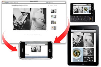
Need an example?
Check this post out on your mobile phone or tablet (or both). Try scanning the QR code to the right and in the footer. Want to have something like this done for you? All you have to do is ask.

Jenee Echard
My 3-year-old is a smartass, just like me. I’m a sucker for banjos, harmonicas and ukuleles. I am painfully shy, so I can come off as snobby. I love my work. I enjoy being challenged.
Get the Email
Join 1000+ other subscribers. Only 1 digest email per month. We'll never share your address. Unsubscribe anytime. It won't hurt our feelings (much).
Discussion
Comments are now closed.