Pay Attention to Footers
A little website footer fetish.
Website footers are under-utilized and pretty much ignored by most web designers. But, if we are trying to find ways to improve the user experience, we shouldn’t neglect what’s at the end of the page. An engaging footer provides guidance and next steps.
Why You Should Pay More Attention to Footers
They say to mention your name at the beginning and at the end of a lecture, because people most likely remember the first and last things you say. Whereas headers are given the most thought, footers are often neglected. Here’s why we should pay more attention to footers:
- Footers are on every page just like headers.
- Natural scrolling to the footer tells us the user didn’t find what they wanted.
- There are certain conventions that users expect to see in a footer.
What should the user do when they’ve reached the bottom of the page? Tina Yeung, a web designer at Growth Spark, puts it like this:
“If we entertain the idea that people have been conditioned to think there isn’t much value at the end of the page, then it’s because of past experiences where footers have not provided them with enough information to make them pay attention.”
I’d say she’s right. A few links to your social properties and a copyright is hardly worth my time. We can do better.
Footer Conventions
As I mentioned before, many conventions exist when it comes to what’s included in footers. Your users might head down there to gather contact information, location, hours, etc.
To paraphrase Zurb, we want to provide valuable information in the footer so that the user will return, as well as links presented in good hierarchy to help with secondary navigation.
Knowing that websites and web design goals vary greatly, footer designs should vary equally. That said, there are a few common elements you should be familiar with. Things like…
- User Sitemaps (not the XML one)
- Contact Information
- About Information
- Copyright
- Signups Forms
- Links to Social Properties
I know what you’re thinking. JDM Digital’s new and (admittedly) experimental site doesn’t include a majority of these elements and that’s a fair statement.
In our design, we limited our footer to copyright and a contextually-relevant link. That’s it.
That’s all we included because our design is experimental and based on the idea that less is much, much more. You’ll notice we also don’t have a header, or main navigation (that’s what the home page is), or signup forms (except on the home page). We’re weird. Do as we say, not as we do.
Now, let’s get back on topic.
Footers are Guides
Once a user scrolls passed your main navigation, the user might still be lost. There is never enough space up top for all of the information you want users to see. Thankfully, research shows that users DO, in fact, scroll all the way down a page. And that’s where footers come in.
You might think footers get ignored like a busboy at Hooters, until you need something that’s not typically found in the header.
For example, when I’m shopping, I look for store locators, shipping information, return and exchange policies, in the footer. I expect to find this information in the footer of an eCommerce site. It disappoints me when I don’t.
Classy Footer Examples
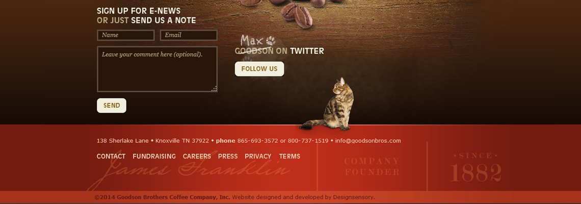
There are some examples of creative and functional footer designs featured in a gallery on SmileyCat. The following is one we’re particularly (perhaps unhealthily) fond of…

Seize the Footer
Footers haven’t been treated with the same enthusiasm and love as headers, but your footer is also on every page and should be just as well-designed as the header.
Footers can help enhance retention, provide secondary navigation and drive users to better engagement. Footers are your last-ditch change to get users’ attention. Take the opportunity and start thinking about footers as the “prize at the end” and not a “goodbye, thanks for coming.”
Get the Email
Join 1000+ other subscribers. Only 1 digest email per month. We'll never share your address. Unsubscribe anytime. It won't hurt our feelings (much).