The Process behind our Rebrand
JDM Digital is proud to announce we’ve launched a new flat, metro-inspired brand and website. Since our founding in 2006, JDM’s brand has undergone just a handful of real rebrands, but never anything as drastic as this one. Here’s a little background on the design process that got us from there to here.
Flat & Metro
The term “skeuomorphic” is enough to make anyone conjure up images of mad scientists and experiments gone wrong, but really it’s just a term meaning “realistic.”
“Flat” design, is exactly the opposite of skeuomorphic and although it’s nothing new, it is super-fashionable as of late (the new iOS and Windows 8 are both flat, metro UIs).
Flat and Metro designs force us to keep it simple, minimalistic and use bold colors.
And that’s pretty much the JDM brand: simple but bold.
The New JDM UI
In coming up with the new JDM design, we let ourselves get inspired and we made NOTHING off limits—not even our logo. We started with wireframes and worked to remove half of what was on the page. Then, we worked to remove half of what remained and so on. The result is what you see today.
Now, if you look at your own site and think there’s nothing you can live without, consider what we removed.
No Main Navigation
We removed the main navigation from the top of all interior pages and replaced it with only the most basic of options: search, home, and next/previous. The home page was removed as a top-level overview page and replaced with what is essentially a metro navigation (tiles).
No Sidebar
Tag clouds, category listings, social feeds, and more are all pretty much ignored and take up way too much room. We removed the sidebar from ALL pages. The result is a more enjoyable read without distracting “stuff” in our sidebar. Honestly, sidebars are garbage.
No Tophat
Typically when you have a lot of web properties (as we do), you put links in what’s called a “tophat.” For many years, the most famous tophat was Google’s. Here’s what it looked like:
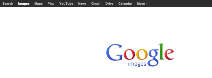
After even Google did away with their tophat, we thought we should find another way. What we came up with is our “panel.”
Hidden by default, users can open the panel by clicking the fixed-position black box at the bottom-left of our site to reveal links to all our web properties.
No Logo?!
I know what you’re thinking. You HAVE to have a logo on every page of your website. We tend to disagree.
We did put it at the top of our panel and on the home page, but it really serves no real purpose elsewhere. We always call ourselves by name above the fold, so you know where you are and, let’s face it, JDM Digital’s logo is not iconic like, say, McDonald’s is. We could do without it—and we did.
No Search Bar
Site search is sort of the ultimate site navigation. In at least one version of our new website, the entire home page was just a search box. We decided against it and the search bar. Instead, users can click the search icon at the top-left of interior pages or posts to open a full-screen search interface.
We also spent a lot of time working a sophisticated search results page and updated search algorithms–but let’s not get too technical.
8 Pages or Die
One of our main goals when building the new site was limiting the number of pages to 8 or less. To make it even harder on ourselves (though easier on visitors), we made these 8 pages the only ones navigable from the home page.
There are many more (about 200), but those are only accessible by searching from the site. That was on purpose. The flow is simple and forces us to be brief. If a user has questions, they can contact us (for a beer, of course) or search and they’ll almost certainly find what they’re looking for.
Demo Video
We did a little demo video about the new site for an award submission. The video also includes a peek into myJDM, our own client management portal. It’s usually something only clients get to see, but a little video never hurt anyone–right?
Simple is Beautiful
The whole process took us more than a year as we always put client work ahead of our own. It was gut wrenching. There were disagreements. But the result is worth every late night on a weekend.
My biggest takeaway from our own rebranding exercise is this: simple is beautiful; simple is hard; simple is worth it.
Update: JDM10
Yup, we did it again. Meet the 10th iteration of our Brand. Meet JDM10.

Justin Downey
Justin Downey is Founder and President of JDM Digital. He's a closet nerd, loves craft beer, and is a poor (but improving) golfer.
Get the Email
Join 1000+ other subscribers. Only 1 digest email per month. We'll never share your address. Unsubscribe anytime. It won't hurt our feelings (much).
Discussion
Comments are now closed.