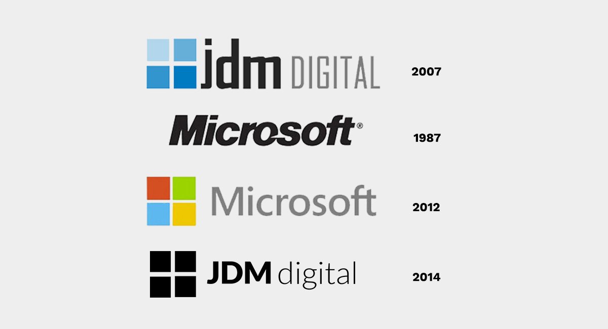
Microsoft New Logo look Familiar?

Despite popular articles asking how Microsoft lost its mojo, the tech giant sees 2012 as a year of rebirth (according to their blog anyway). On Thursday, Microsoft unveiled its first new logo since 1987. While Adweek writers see it as ‘pretty damn nice‘, we can’t help but ask: “Does that logo look familiar to you?!”

Since JDM Digital rebranded in 2007, we’ve gotten mixed reviews on our logo. Some said it was too simple (and un-copyrightable). Others just gave us the “I don’t get it” verbal shrug.
I can’t speak for what inspired Microsoft’s, but the JDM logo has two parts. The “JDM” nameplate is in a stylized font called “Agency”, for obvious reasons. The four-square logo bug is designed to never go out of fashion (much like that little black dress). The four boxes are actually the same color but at four different transparencies (25%, 50%, 75% and 100%) symbolizing our services working together and becoming greater than the sum of their parts.
Finally, once you’ve seen our logo, you see it all around you – in the tiles on the floor; the window panes beside you; the shape of your morning cross-word puzzle… and now atop Microsoft.com. <wink>
We couldn’t have done the rebranding better ourselves, Microsoft… <elbow, elbow>
UPDATE: We’ve done it again. Check out the process behind our latest brand refresh.
Get the Email
Join 1000+ other subscribers. Only 1 digest email per month. We'll never share your address. Unsubscribe anytime. It won't hurt our feelings (much).
Discussion
Comments are now closed.