Creative Business Card Inspiration
Just a few wonderful examples to help get your creative juices flowing when designing your business card.
Even in a digital world, professional business cards are a must for sales and marketing. What better way is there during that critical first meeting to differentiate yourself and leave a lasting, first impression than using a subtle, but creative business card?
Here are a few wonderful examples to help get your creative juices flowing. You may even find this workhorse becomes the star of the show.
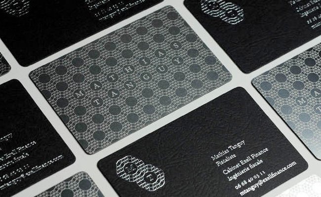
Add Some Texture
Whoever said a business card has to be flat, smooth or even white? A little texture or pattern can really help your brand stand out.
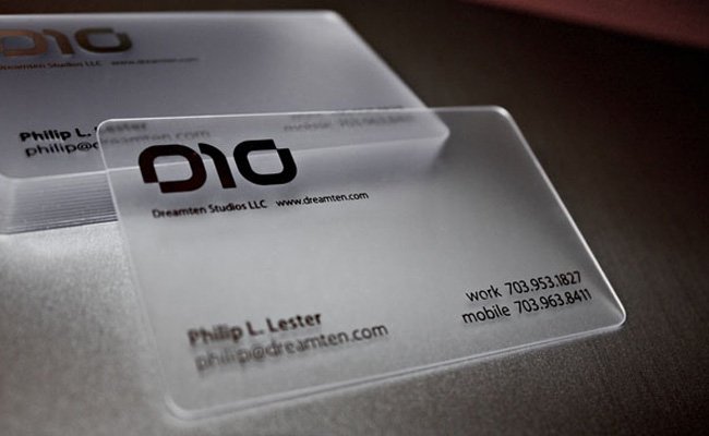
Be Transparent
We all have a stack of business cards sitting in our office desk drawer, at least I do. Looking into a different kind of material, like clear plastic, sends a clear (get it?) message that you’re not like everyone else.
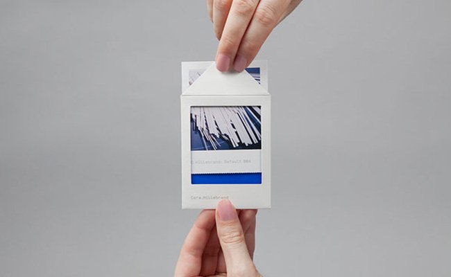
Creative Packaging
This one is just too cool not to include in our list.
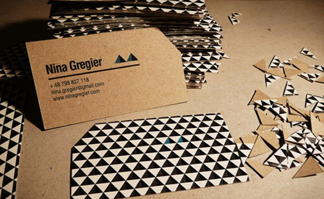
DO Cut Corners
Rounded corners are ok, but everyone does them these days. Take the afternoon and cut the corners off a stack of your business cards for a “custom” feel that will cost you nothing.
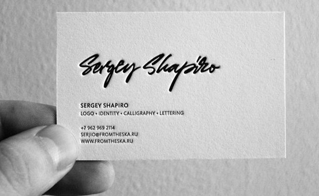
Minimal and Letterpressed
We mentioned texture before, but we’ll mention it again because texture doesn’t have to be distracting.
Go Big or Go Home
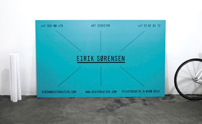
Don’t sell yourself short. Spend a little time and money on really great business cards. They’re an inexpensive way to create reactions.
Get the Email
Join 1000+ other subscribers. Only 1 digest email per month. We'll never share your address. Unsubscribe anytime. It won't hurt our feelings (much).