Designing a Web Form that Converts
Love ’em or hate ’em, forms have become an integral part of websites and the Web.

Primarily, the ever-present web form is there to help both users and businesses achieve separate goals by establishing a “value exchange.” However, businesses get greedy asking for too much information in exchange for too little to the user. Let’s look at how we might strike a balance.
3 Types of Web Forms
Generally speaking, there are three types of web forms: Registration, Checkout, and Data Submission.
- Registration forms allow people to become members of an online community or service.
- Checkout forms facilitate a transaction. These could be your typical eCommerce checkout form or a subscription to a paid service.
- Data Submission forms require a user to give up a little information about themselves in return for what’s behind it. Sometimes this is called ‘gated content’.
Whatever the form, there needs to be an adequate value exchange in the user’s favor. For example, I might give you my email address in return for receiving your excellent newsletter. I’d need a lot more than just a newsletter if you want to know my name, location, annual household income, etc.
So the #1 thing that makes a form convert is a positive value exchange. After that, the function of that form can only help increase that conversion ratio.
Let’s explore a few elements that make up a form with a high conversion ratio.
Labels
These literally label your input fields and inform users what information they need to provide in a given field. You might think there’s little room for design improvement on labels, but you’d be wrong. Here’s a few best practices for form labels.
- Top aligned labels are a safe bet.
- Left aligned labels are best when the form is very long.
- Labels are not help text. Use succinct, short labels.
- Use HTML placeholders for examples–not in place of labels.
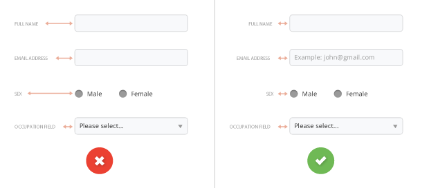
TIP: If you decide to use labels on the left of the form, make sure the labels’ text are right aligned. This makes it easier to scan the page.
Input Fields
This is where the rubber meets the road. There are all sorts of form input types – text fields, passwords, email, dropdowns, checkboxes, radio buttons, datepickers, sliders–the list goes on and on.
- Use a dropdown whenever possible–it’s faster for the user and easier for you to run reports against this structured data.
- Visually group related fields such as first name and last name. It’ll make the form seem smaller.
- Use the right form input type. Datepickers can do in 1 field what a dropdown would need at least 3 (Month, Day, Year).
- Avoid optional fields in forms. The fewer the form fields (optional or required), the higher your conversion rate will be.
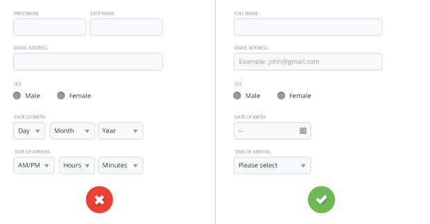
TIP: Try to minimize the number of fields as much as possible. This renders your form less intimidating, especially when you require a lot of information for your users.
Contextual Help
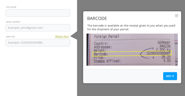
For non-traditional inputs, like a special code found elsewhere, always provide the user a little help with HOW to find that information. Hover tooltips are good, but a simple modal help window can do wonders.
Validation
A web form needs to validate input, but more importantly it needs to be able to provide feedback. A form which cannot be submitted and doesn’t really tell its users why, is worse than useless.
- Users should always be allowed to click on the submit button. Disabling buttons because the form is invalid is a very bad practice and should be avoided;
- Real-time validation is a good practice – especially when different input fields relate to one another;
- When form submission fails, a top-level error message should appear with a double visual emphasis (typically red in color with a warning icon) above the form and indicate why it failed;
- The erroneous fields (if any) should be highlighted and visual associated to the top-level error;
- Validation text should be provided next to the erroneous fields giving an easy-to-understand solution on how to correct them;
- To avoid confusion, reserve the red color and warning icons for error messages and destructive actions only.
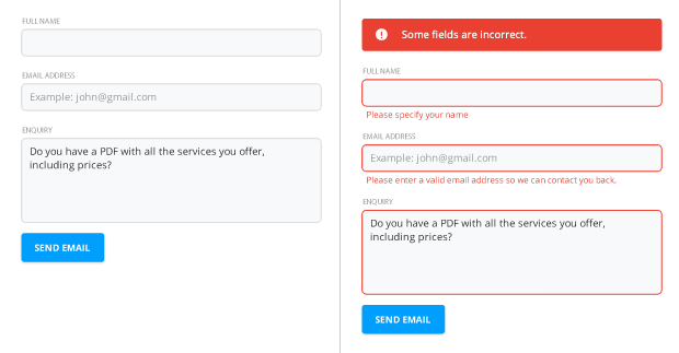
TIP: Be descriptive in your field error messages. ‘Username already in use’ is a much better message than ‘Invalid username’ – it doesn’t help the users at all understand what went wrong.
EXTRA CREDIT: There are a ton of really powerful form validation scripts you can use. Perhaps the easiest to validate a form without having to reload the page is jQuery Validate. You can also look into real-time (as in, onkeyup) validation, though that can get messy on mobile devices.
Submission Buttons
When clicked, these buttons trigger the form action, such as submitting the form. In fact, the HTML often looks like <input type="submit" />. Unfortunately, a lot of developers will also set the value (or button label) to “Submit”. Never submit. Make it something actionable and specific.

Trust
Gaining a users’ trust takes time and it’s a good practice to introduce a trust factor into your forms. This could be a privacy policy or a short blurb saying “We’ll never spam you.” Better yet, introduce a 3rd party. That could be a security seal, your BBB rating, or call-out the form’s SSL. Whatever works for you as long as it helps reassure the user that your company is reputable and conforms to basic ethical standards.

Use Web Form Standards
Make sure you set the tab index correctly so users can jump through fields in order by using the Tab key. It’s also important to conform to HTML web form standards by, for example, using <form role="form"> Occasionally, I come across sites which don’t and they quickly become a pain to use as my browser is not able to automatically fill in the details for me.
Just another reason web standards DO matter.
Get the Email
Join 1000+ other subscribers. Only 1 digest email per month. We'll never share your address. Unsubscribe anytime. It won't hurt our feelings (much).