Frost Bank’s Website Redesign
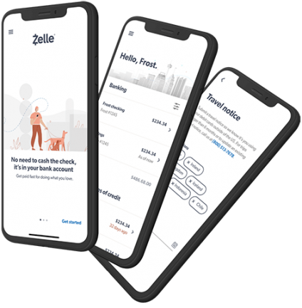
Frost Bank is debuting a much-needed website redesign of their responsive website and native mobile app.

This month, Frost Bank will be debuting an updated, minimalist design for their website as well as their native mobile app according to an email announcement sent to customers.
 The new minimalist design uses a single large font (Gibson) in a variety of weights to denote visual hierarchy. From what we can tell, the frontend framework is the most popular HTML, CSS, and JS library in the world, Bootstrap 4. You can probably guess that the designers at JDM Digital love that style too. ;)
Aside from pure aesthetics, the company is also touting new security features, more control over notification settings, and a much more concise, conversational tone.
Changes should roll-out for both the website as well as the mobile app sometime in November 2019. See their (pretty cool) prelaunch landing page for more information.
At a time when huge banks like J.P. Morgan Chase and Wells Fargo have websites that still look like they were designed in the late 2000s, Frost gives us hope brands still have the courage to make decisive and significant design changes to their most public face—their website.
Get the Email
Join 1000+ other subscribers. Only 1 digest email per month. We'll never share your address. Unsubscribe anytime. It won't hurt our feelings (much).