Life Below the Fold: Is Scrolling Bad?
There's a lot of people who think information on a website below the 600px height (aka "the fold") is as good as gone. That simply isn't the case, and I should know. I'm a copyright notice.
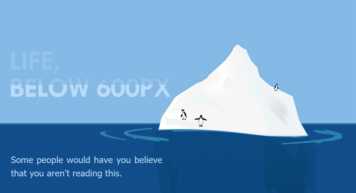
There’s a lot of people who think information on a website below the 600px height (aka “the fold”) is as good as gone. That simply isn’t the case, and I should know. I’m a copyright notice.
Ever since the first person wrote something online they thought was worthy of a copyright notice, I’ve lived here, far below the fold.
Over the years, I’ve seen a lot of changes in web design. Some come and go. Others rise and fall, only to rise again in popularity. Perhaps my favorite is the (silly) concept of “the fold.”
A nod to the newspaper days of old, “above the fold” refers to the location of an important news story or a visually appealing photograph on the upper half of the front page of a newspaper. In web design terms, it usually refers to the first 600px of vertical space: what you see before scrolling down.
I hear clients and agencies talk about those of us living “below the fold” all the time. The conversation usually goes something like this:
Agency: “Here’s the website comp. Isn’t it awesome!”
Client: “Where’s the fold?”
Agency: <turns on the guides/rulers> “Right here.”
Client: “Hmm, yeah, we’re going to need those articles, these links, and these 6 images to be above the fold.”
And just like that, there goes any sense of user experience, readability, and storytelling. :(
The path to the prize
I’m not saying the fold doesn’t matter at all. Designers simply need to think more in terms of “the prize” (what you want your readers to get out of the page), and worry less about arbitrary vertical space.
Credit: Paddy Donnelly
Back when my copyright date was young, everyone sort of agreed that “the prize” should be at the very top. Everything below that was pretty much wasted space.
The internet was slow, and everyone had clunky mousewheels that took forever to scroll to the bottom of a page. Scrolling was a chore.
Now we’ve got broadband speeds everywhere, touch screens galor, and more intuitive OS interfaces, scrolling is just more fun (gives me hope).
These days, USING the scroll to build value and tell your story before getting to the prize can pay off by creating a unique user experience for your readers.
So, the first 600px still matter. They just aren’t the prize. They make the promise of a prize.
Don’t take my word for it.
What do I know. I’m just a copyright notice. Some really smart people did some research, and turned up these results:
- ClickTale found people used the scrollbar on 76% of the pages, with 22% being scrolled all the way to the bottom regardless of the length of the page. That said, it’s clear that page top is still your most valuable screen estate.
- Jakob Nielsen’s eye-tracking studies show people DO scroll down, though they focus their attention above the fold initially.
- Milissa Tarquini found that the most clicked link on the AOL homepage is at the very bottom (next to me).
- Eye-tracking by CX Partners confirms people do scroll if certain design guidelines are followed.
- Jared Spool’s usability tests from 1998 tell us that, even though people say they don’t like to scroll, they are willing to do so. Moreover, longer and scrollable pages even worked better for users.
- SURL conducted another usability study, confirming people find both scrolling on search results pages and regular web pages “natural.”
- More recently, check out this article on the community-contributed blog, Cometrics.
Perhaps a little less scientific, it’s worth mentioning that in July 2011, Apple removed the scrollbar from Mac OS X. That pretty clearly illustrates that even the usability experts at Apple believe that people are SO familiar with scrolling, they don’t even need a visual cue for it.
According to the Neilsen Norman Group, user scrolling vs attention follows one of the two behaviors illustrated in the following gaze plots:
![]()
So, give the fold the finger!
The web is filled with boring websites with boring layouts (big header with call-to-action, 1/4 sidebar, footer with useless stuff in it). Don’t blindly follow layout “rules”. Challenge them to the delight of your audience.
I’ll be here, at the very bottom of the page, watching. ;)

Justin Downey
Justin Downey is Founder and President of JDM Digital. He's a closet nerd, loves craft beer, and is a poor (but improving) golfer.
Get the Email
Join 1000+ other subscribers. Only 1 digest email per month. We'll never share your address. Unsubscribe anytime. It won't hurt our feelings (much).
Discussion
Comments are now closed.