AMP for WordPress Now Supports Pages
The latest version of the AMP for WordPress plugin now adds support for WordPress posts, pages, and custom post types. Accelerated Mobile Page lovers rejoice!

The AMP for WordPress plugin adds support for the Accelerated Mobile Pages (AMP) Project, a Google open source initiative to provide mobile-optimized content that loads nearly instantly everywhere.
Earlier versions of the plugin (see the review here) only enabled AMP for WordPress Posts. After much debate, this latest version of the plugin now adds support for WordPress Pages as well as Custom Post Types. WordPress AMP lovers rejoice!
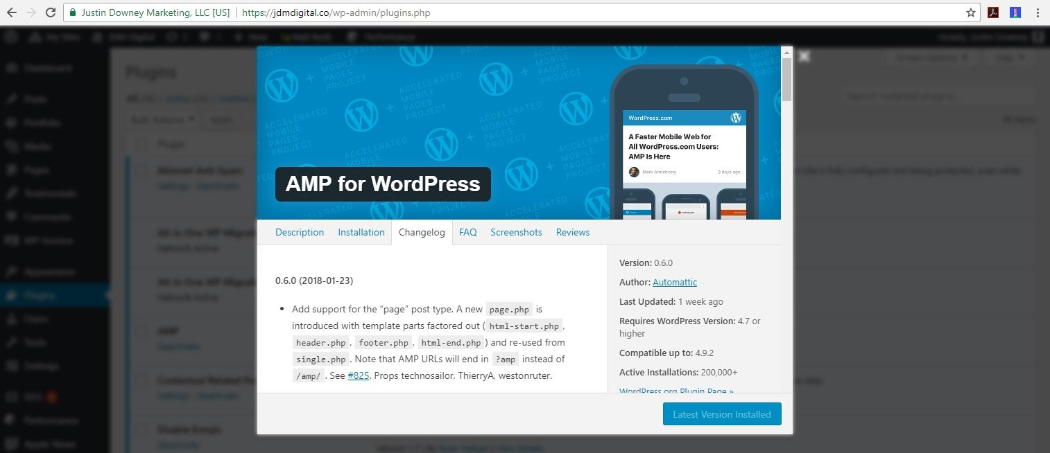
If you’re not familiar with this whole “AMP” stuff, please read this primer first.
The New Setup
Once you’ve updated the AMP for WordPress plugin, head over to AMP >> General to update the settings. You’ll find you’re now able to select “Pages” as well as any custom post types you might be using. In JDM Digital’s setup, we have a custom post type called “Work” which houses our portfolio.
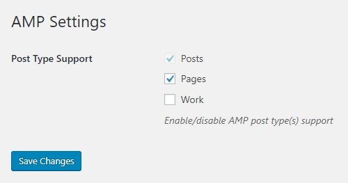
Even after you’ve selected at least “Pages” from these settings, you’re not quite done yet. The plugin defaults to AMP: Disabled for pages. You have to enable them individually on a page-by-page basis. I wish this was possible via the bulk editor, but it’s not that hard and it forces us to make sure each of these pages look awesome in their AMP form.
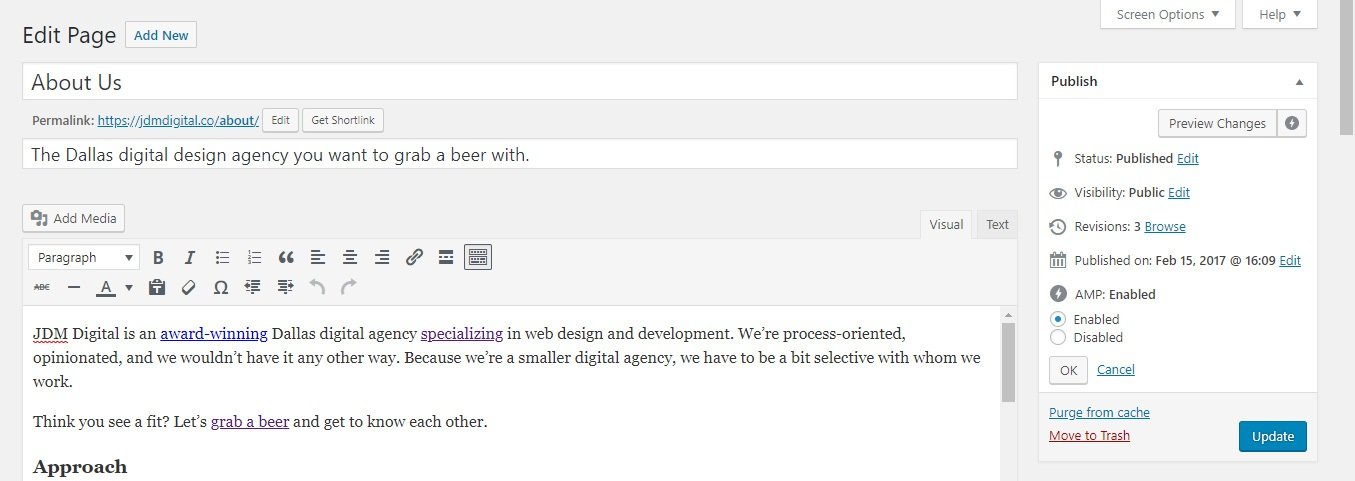
Once enabled, click Update and check out the page.
No difference?! That’s cool. In this new version, you have to append the query string ?amp to see the AMPed version of your page.
So if your page was yourwebsite.com/about/, go to yourwebsite.com/about/?amp to see the AMPed version in your browser.
Let’s Validate
Everything should be good to go already, but you’ll want to make sure your AMP pages validate. Thankfully, Google has a free AMP Validator you can use to both validate and submit the AMP version of your pages to Google’s lightening-fast AMP cache.
Paste the regular URL of your page into Google’s AMP Validator: https://search.google.com/test/amp
It’s a good idea to use the regular, non-AMP URL. You’ll see why in a moment.
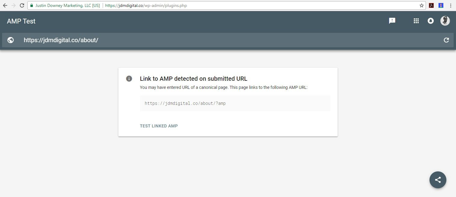
Great! This means the <link rel="amphtml"> tag has been added to your <head> and is working as it should. Now, let’s click Test Linked AMP.
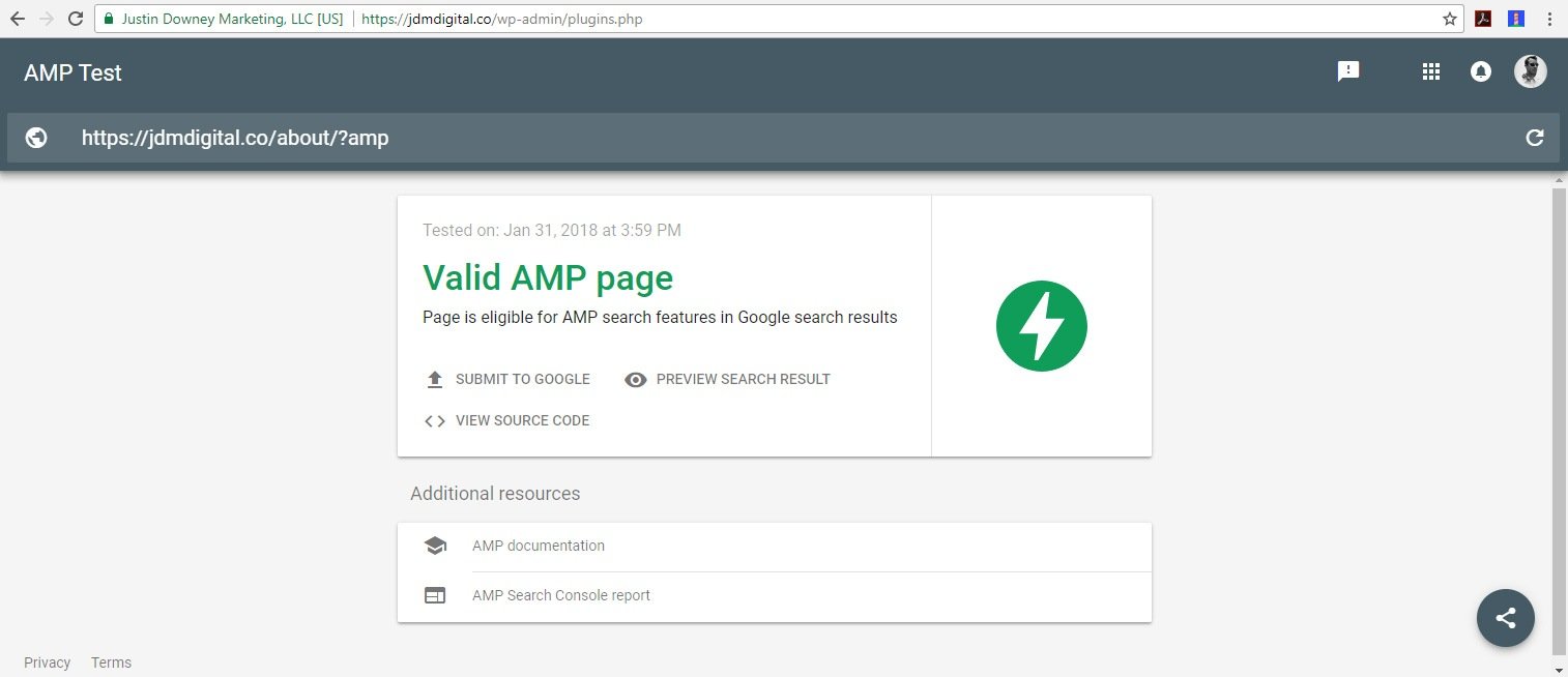
Bravo! You can now click Submit to Google, or preview how this might now look in search results.
Other Changes in v0.6
Before I leave you, let’s talk a little about some of the other changes in v0.6 of the AMP for WordPress plugin.
Template Structure Changes
Perhaps most importantly, if you’ve done some heavy customization to your AMP templates, you’ll want to redo those. Version 0.6 has completely redone the template system to split-up the different templates. Looking at the discussions on the plugin’s GitHub repo, this appears to be a change they’re going to stick with. So, let’s get with the program.
First off, let’s look at these new templates. You’ll find them in the plugin at: /wp-content/plugins/amp/templates/
Looking at those, you’ll see they’ve changed the template structure. No problem. Copy all or some of those files into a /amp/ subdirectory in your custom theme. These templates in your theme will overwrite those that came with the plugin.
The new template structure looks something like this for WordPress pages (uses /templates/page.php):
html-start.php
header.php
header-bar.php
page.php OR single.php
footer.php
html-end.php
You can edit the AMP CSS file to your heart’s content. It’s located in /templates/style.php.
The new template structure looks fairly self-explanatory and vaguely similar to how WordPress typically handles theme template structure.
If that last sentence just made your brain bleed, ask us questions below in comments, or better yet, contact us.
No Glue Needed
We’ve recommended using the plugin, Glue, if you’re using both this plugin and WordPress SEO. You don’t need them both any more and, for the time being, Glue will prevent your AMPed Pages from displaying. So, just deactivate the Glue plugin and you’re good to go.

Don’t worry, v0.6 also comes with much better structured data, which is what Glue was fixing anyway.
Get the Email
Join 1000+ other subscribers. Only 1 digest email per month. We'll never share your address. Unsubscribe anytime. It won't hurt our feelings (much).