Lessons on UI Design from the Failures of Windows 8
You can learn about User Interface (UI) design, particularly for web applications, looking at the design failures of desktop and mobile operating systems--chiefly, the resounding failure of Windows 8.
You can learn about User Interface (UI) design, particularly for web applications, looking at the design failures of desktop and mobile operating systems–chiefly, the resounding failure of Windows 8.
Now, I’m not going to just beat-up on Windows 8 or Microsoft for that matter. That horse is long dead. Rather, let’s look at a few UI design lessons we can learn from that failure.
Don’t Ignore Design Conventions
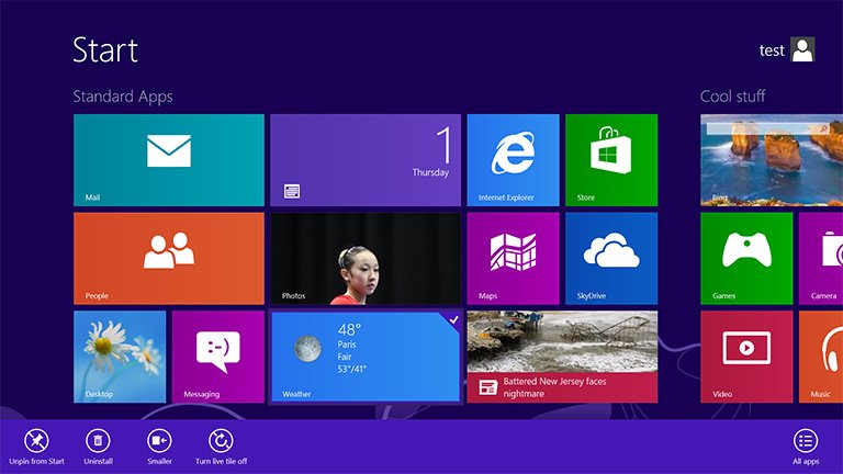
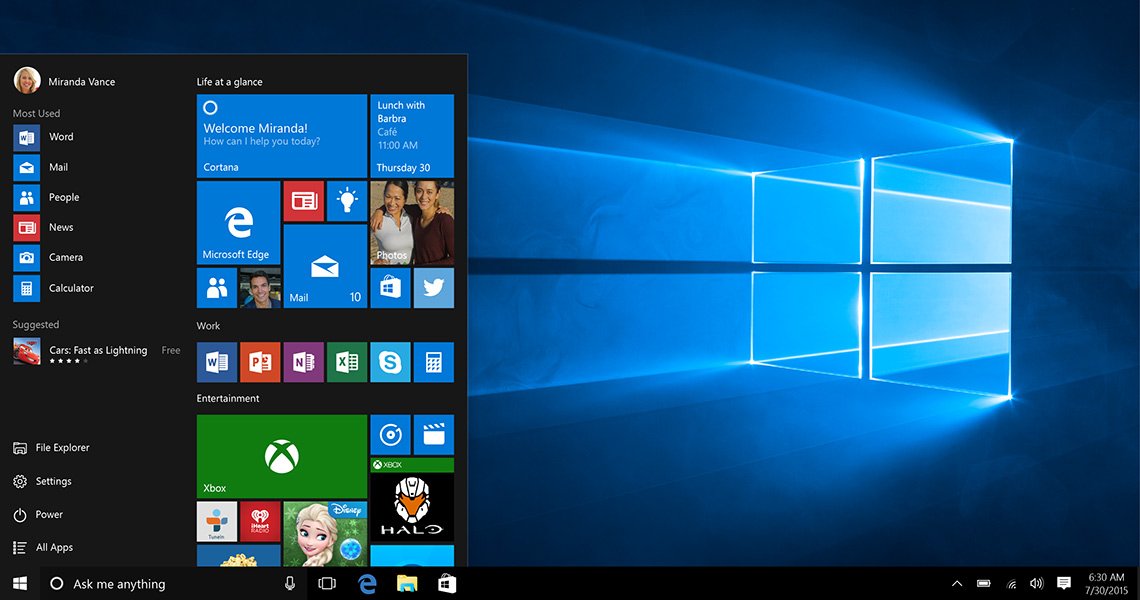
Windows 8 removed the Start menu (a staple since Windows 95) and created two completely different UI layers (a metro tile and a more traditional desktop) which users were supposed to navigate back and forth through. That flew in the face of their own design conventions to the collective “boo” of even their most loyal users.

Design conventions are conventions for a reason. They are generally-accepted interface elements that need not be toyed with. They add familiarity and trust to your application’s UI. There’s no need to over-complicate with elements and even a navigation structure that breaks the mold of everything your users have seen before.
Create Multiple Interface Paths
Let’s say you want to open Add/Remove Programs in Windows 8. You can look though ALL your programs in an enormous grid with tiny icons, look for the Control Panel app (you have to know it’s in there), and find the Add/Remove app; or you could use their live search (hidden off the edge of the screen) but you have to know the name of the program specifically. Those are pretty much your only two options. Both are pretty terrible.
As redundant as it might seem, you need to create multiple paths to the same or similar views in your application. For users that want to change their password, there should be a link on their Profile view. There should also be a direct link in a Username >> Profile, Change Password, Logout dropdown. Why not include a link on the Dashboard view too? How about a redirect option on the login screen (I want too… Change my password)? Yes, yes, and double-yes.
Creating multiple paths to access application views gives the user more ways to navigate the site the way THEY want to–not just how the designer might be accustom to navigating.
Don’t Bury Views in Secondary Navigation
Although Windows 8 was pretty bad about this, MailChimp’s otherwise wonderful application interface is the worse offender. In MailChimp, many of the application’s views are hidden in a sub-navigation that you don’t know is there until you’ve already entered that part of the application.
For example, if you want to upload a new list to MailChimp, you have to intuitively know to click on “Lists” from the main navigation (no dropdowns available). Assuming you guessed correctly, there’s no option to Upload a List. You have to, again, assume you have to “Create” a list by clicking that grey button, THEN you can upload a list. That’s a lot of guessing.

They buried that view in secondary (or tertiary) navigation with no obvious indicators. You just sort of have to “click around” or search to find it.
Instead, create interface elements that don’t depend on guessing. Maybe a dynamic list of “Common Tasks” links in a sidebar. You could also create a button dropdown. Even better would be to simply create a dropdown menu in the main navigation. That would be a pretty conventional approach and, as I said, conventions are conventions for a reason.
Search is the Ultimate Navigation
One thing Windows 8 did REALLY well was a super-fast real-time search option. Unfortunately, they hid the best part of their design in an inconsistent right-hand sidebar only accessible to those that already know it was there. You may have noticed that in Windows 10, that element is now given a place of honor–right next to our old friend, the Start menu button.

Follow Windows 10’s lead and look at search in your web applications, not as a last resort but as the ultimate in navigation. Twitter’s Typeahead.js (with Bloodhound) is fast, smart, and scalable JavaScript library that makes designing and development of a Windows 10-like search bar a snap. Look into that.

Sorry Windows 8
Microsoft is already sun-setting support for Windows 8.1 and by naming the very next version Windows 10, it’s pretty obvious they want to distance the two operating systems from one another as much as possible. I don’t blame them. I don’t mean to beat up on Windows 8. But, it sure taught UI designers around the world a few valuable lessons.
Get the Email
Join 1000+ other subscribers. Only 1 digest email per month. We'll never share your address. Unsubscribe anytime. It won't hurt our feelings (much).