5 Web Design Myths

Everybody’s a web designer these days. Darn few spend the time it takes to really understand the subtleties of web design and, instead, rely on commonly-held beliefs. Unfortunately, many of these beliefs are just plain wrong. Let’s look at just 5 of our favorite website design myths.
A quick Google search for “Web Design Myths” will come back with all sorts of articles with a wide variety of ideas on dos and don’ts. Some are great (looking at you, Website Magazine), some are not-so-great.
We do this for a living and we’re not trying to sell banner ads. We’re just design nerds. Here goes…
Myth 1: The home page is the most important page.
Fact: Unless someone is going directly to your website, people probably won’t land on the home page. In fact, since the exacting powers of search engines and paid links to targeted landing pages, it’s quite possible visitors will NEVER see your home page.
What’s so relevant about your home page anyway? It’s it just a jumping-off point? Yeah. That’s what I thought.
Myth 2: White space needs to be filled in.
Fact: The opposite is true. White space is a design term meaning “breathing room” around elements. You have to have adequate whitespace (which isn’t necessarily white, by the way) so your design doesn’t look cluttered.
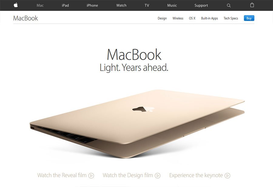
Good designers allow enough white space for their audience to breath and read more easily. Great designers use white space to their advantage. Take Apple’s use of white space as an example.

Photo credit: Apple, Inc.
Myth 3: The more choices the better.
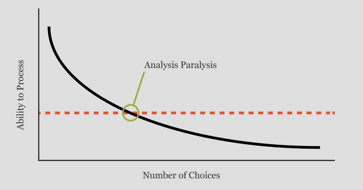
Fact: It couldn’t be further from the truth. The more choices, the more confusing it gets. Hick’s Law tells us that as the number of available options increase, so too does our reaction time. In other words, the more choices we are presented with, the more confused we are. Put simply, less is more–a lot more.

Myth 4: Primary content belongs above the “fold”.
Fact: Once upon a time, that may have been true–not anymore. These days, cramming too much content above the fold can seriously impact how the content displays across various devices. Studies have shown time and time again, we don’t mind scrolling and are perfectly willing to in order to find the information we’re looking for.
Myth 5: You view your website like your users do.
Fact: No one views your website like you do. This is an all-too common problem. Business owners and key employees tend to assume potential customers read and understand the website the way they do. Trust us, they do not.
Your website needs to communicate with your audience where they are now in the buyer’s journey–not where we want them to be. Remember, you’re website isn’t speaking to you. It’s supposed to be speaking to your audience.
Get the Email
Join 1000+ other subscribers. Only 1 digest email per month. We'll never share your address. Unsubscribe anytime. It won't hurt our feelings (much).