Top 10 Web Design Trends for 2020
The only constant in web design is change.
When it comes to web design, the only constant is change. In 2020, advances in technology are paving the way for endless technical and creative possibilities. There was once a huge gap between what designers could do in print and what they could do on the web. That gap has essentially inversed–to the delight of web design nerds like us.
So, what web design trends might we see in 2020? Speaking as a digital agency specializing in web design, here’s what we’re seeing as the top 10 web design trends for 2020.
Top 10 Web Design Trends
- Dark UI Mode
- Imperfections Adding Personality
- Soft Shadows, Layers, and Floating Elements
- Mixing Photography with Illustrations
- Solid Frames of Whitespace
- Glowing Color Schemes
- Ultra-minimalist Navigation
- On-Scroll Effects
- Retro Style in Modern Designs
- Voice Technology (VUI)
1. Dark UI Mode
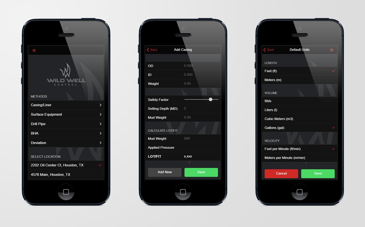
When Apple announced at WWDC 2019 that it was bringing a Dark Mode to iOS 13, we were thrilled. We had already seen the value in dark UI designs in projects we had done for clients like Wild Well Control and to see the design take center stage made our designer-hearts sing. It’s easy on the eyes and it makes colors and design elements really pop.
From a practical perspective, a dark UI is also better for OLED screens as these screens actually “turn off or turn down” the darkest parts of the screen which saves power and extends screen’s lifespan.
2. Imperfections Adding Personality
Imperfect, hand-drawn design elements inject emotion and humanity into websites, which users seem to be craving after seeing perfected yet impersonal graphics dominate web designs for years. In 2020, adding some hand-drawn realness gives web designs the heart and soul visitors find appealing.
Whether it’s hand-drawn icons or hand-made illustrations, in 2020 we’ll see more designers adding purposefully messy-looking elements to their web designs.
3. Soft Shadows, Layers, and Floating Elements
This trend is all about creating depth. Like the 3D effect from above but want to tone it down? Soft shadows and floating elements add interest and depth and give your web page a “3D Lite” look. It’s not just graphics either: you can use this effect with text and photos, too.
“Soft shadows and floating elements create a pseudo-3D effect and make the design more layered and more interesting,” Says Alex Ivanov in an article on 99designs.
There was a time in the late 90’s when drop-shadows were rampant. Then came flat/metro designs. This web design trends is about finding the balance between the two and picking up where Material Design left off.
4. Mixing Photography with Illustrations
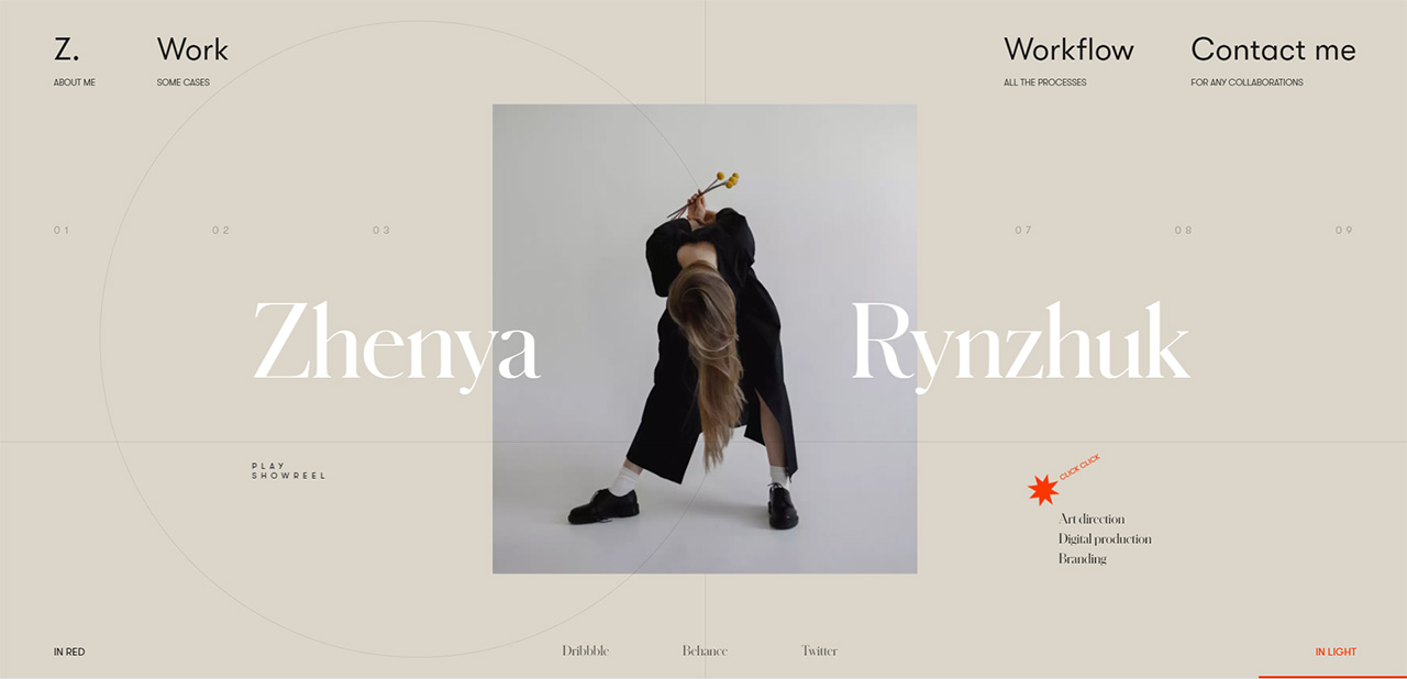
Credit: Zhenya Rynzhuk
Overlapping illustrations on top of real photographs creates a memorable visual, which lets your creativity go wild.
This collage-like trend is a versatile one; you can use it to add a special cuteness and charm to an otherwise bland photo, or you can use its more serious attributes to better communicate complicated or abstract concepts like tech or finance. A design we did for Nobscot is also a good example.
Mixing these two things is a way to customize your imagery and add more personality (a reoccurring trend in 2020) to your web design.
5. Solid Frames of White Space
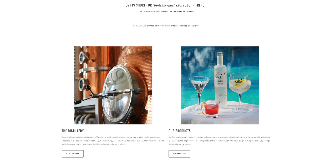
Credit: Daan Spits for QVT
Full width layouts have been all the rage in web design for some time. In 2020, we see designs that “frame” the image to make it stand out. That has a few positive design side-effects. Technically, that means you don’t have to load enormous images in the browser and editorially, you’re not essentially using mega-panoramic images that can stretch from one side of a desktop screen to the other. “Framed” in white space, images will also tend to look better on mobile devices–especially in portrait orientation.
6. Glowing Color Schemes
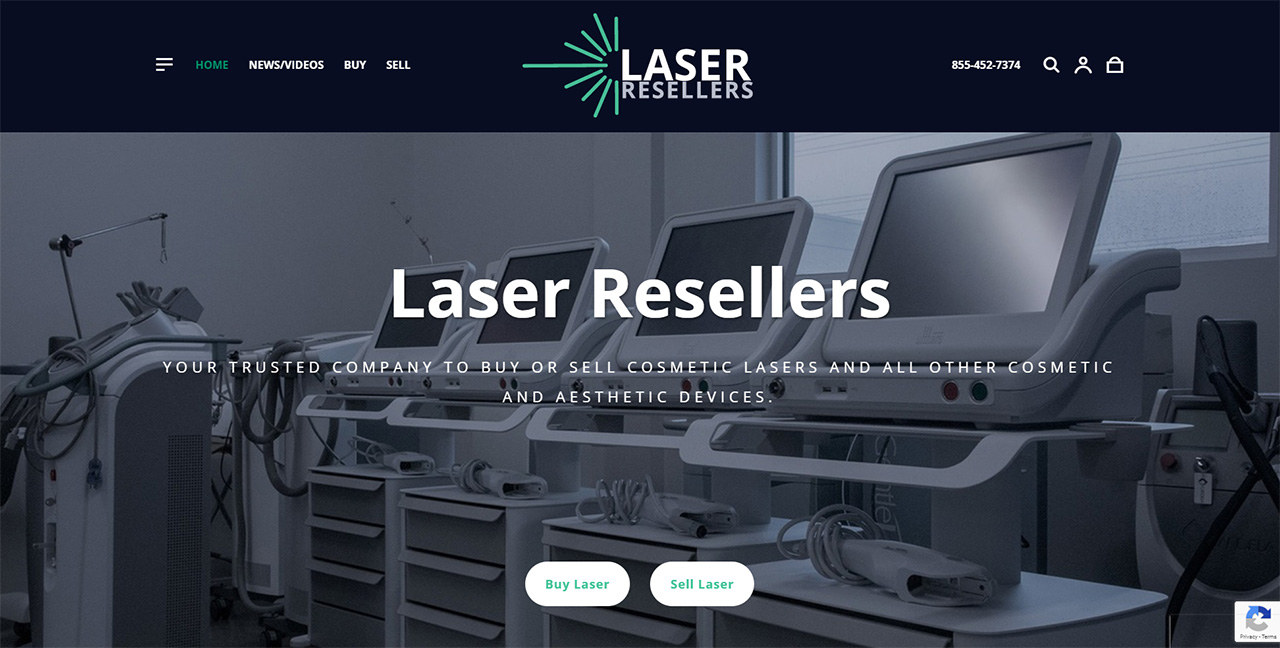
Credit: JDM Digital for Laser Resellers
We’ve been seeing a lot of use of some courageous color pairings to make web design jump off the screen. These bold and daring, glow-in-the-dark, designs have an almost luminous feel. In 2020, we think you’ll see a lot of dark navy paired with mint or acid greens, like you see in the design we did for Laser Resellers (above).
With extreme minimalism and dark UIs on the rise, glowing and luminous colors will have their chance to shine in 2020.
7. Ultra-minimalist Navigation
It’s often said that simplicity is the ultimate sophistication, and many in the industry expect a minimalist, stripped-back approach to become ever more popular in the coming months.
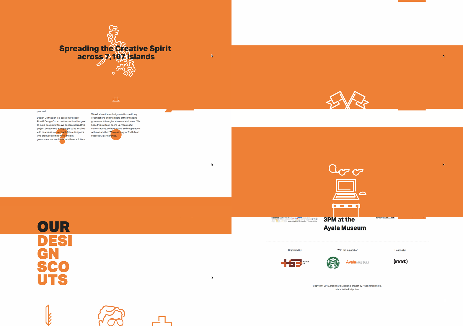
Minimalist design means a hundred things to a hundred different people, but it generally refers to an extensive use of white space, with no single element distracting attention from the visual hierarchy. JDM Digital’s 10th anniversary design is an example of ultra-minimalist, both in web design and in navigation.
This threadbare, stripped-back style means limited color palettes, with content being given lots of room to breathe on a page, like in the example below…
8. On-Scroll Effects
These animations are triggered as the user scrolls down and they come into the viewport. It’s a design trend that’s been around since 2016 and there are all sorts of really cool libraries developers can use, like Wow.js and Waypoints. The Divi theme framework has a lot of these animation components built right in too.
According to ProScore, 68% of the sites tested in the last 12 months have had some sort of animation on-scroll.
9. Retro Style in Modern Designs
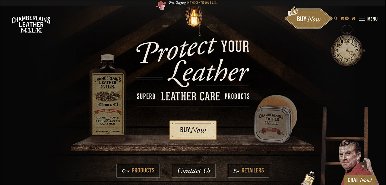
Credit: Chamberlain’s Leather Milk
What once was old is new again–in web design, anyway.
Design concepts borrowed from decades ago are making an impact in digitally today. Many of the ideas and designs were originally created for print campaigns that are making a comeback in the digital space.
What makes retro design styles work is the sense of nostalgia they invoke with users visually. Pair that emotion with a modern interface and user patterns and you’ve got a combination that’s hard not to interact with.
Think big, block-style lettering with elaborate strokes and colors that will take users back in time in an instant. The same can be said for more cursive styles with heavier lines and roughed up edges.
Of course, you don’t have to go all the way back to the 1860s. Think pixel-based, angular designs like we see in old-made-new games like Minecraft and Roblox.
10. Voice Technology (VUI)
Voice technology is another trend experiencing rapid growth in adoption partly as a result of the smart speakers we’ve become so accustomed to in our homes.
“We live in the age of Siri and Alexa,” explains Justin Downey, of JDM Digital. “Audio controls have become our friends and a part of the family. They have changed the way we interact with the digital world. But very few companies have adopted VUI (Voice User Interface) into their digital presence. I’d wager that’ll change in 2020.”
There are even tools already created to allow web designers to add VUI into their websites and applications. Are you using Vue.js? There’s a toolkit for that called Vui. Do you still bleed jQuery? There’s a plugin called Vooi that will recognize and derive user intent on your site.
Aside from interface patterns being controlled by voice, we believe more companies will start optimizing their structured data to include voice-focused and answer sites to make them more readable by AI technologies like Google Voice Search and Alexa.
Looking Forward
With those annoying 2010s coming to a close, web design trends in 2020 will embrace the latest technology and the design freedom it provides like never before. Attention-grabbing visuals and colors, and old trends re-imagined are all clear indicators of this new 2020 style. We see 2020 web design emphasizing user experiences, with minimalist navigation and eye-pleasing dark design interfaces.
As we march on in this new decade, our web designers are simultaneously looking to the future and to the past for inspiration. And thanks to the multitude of opposing design trends, web design in 2020 will be full of surprises. We can’t wait to see what they come up with next.
Get the Email
Join 1000+ other subscribers. Only 1 digest email per month. We'll never share your address. Unsubscribe anytime. It won't hurt our feelings (much).
Notice: Trying to access array offset on value of type null in /home2/justin/public_html/wp-content/plugins/wp-invoice-quotes/lib/class-wp-invoice-quotes.php on line 413