DON’T Make the Logo Bigger
The bigger, and more established the Brand, the smaller their logo.
We hear it all the time. “Love everything, but make the new logo bigger” and we get it. You’re excited about your new corporate logo and branding, but there’s something to be said for subtly.
As you’ll see, the larger and more established the organization, the smaller their logo. Don’t make the logo bigger. You should consider making it smaller.
Many businesses, after the rigmarole of a branding exercise, are so excited about their new logo, they want it to play first fiddle. But, logos are not the star of the show any more than the business. The customer is your audience and they don’t care about your logo.
Purely as an example, here are three large, established brands that show how small logos can make you look bigger.
1. Microsoft
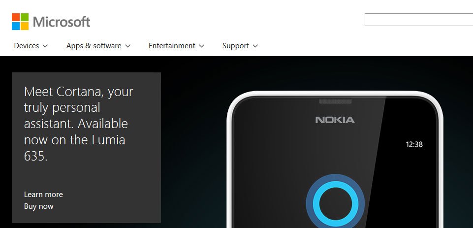
The Microsoft logo is just 160 pixels wide by 34 pixels high. That’s about half the size you’ll find on a small business website where the logo can be as much as 64 pixels high and 350 pixels wide.
Now, if you think Microsoft can get away with a small logo because they’re so recognizable, consider that their logo was completely re-done just a year or so ago. I would venture a guess you couldn’t pick it out of a crowd if it didn’t say “Microsoft” right next to it.
2. Dell
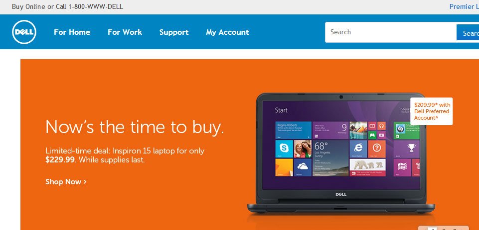
The Dell logo is smaller still than Microsoft’s at just 49 pixels square. Placed directly adjacent to the main navigation, the nameplate (that part that actually says the word “Dell”) is roughly the same font size as the main navigation labels.
If you’re thinking the Dell logo is always presented as small, you’d be wrong.
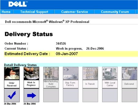
Here’s a screenshot of an older version of the Dell website from the mid-90’s. Notice the placement and shear size of the Dell logo. It’s the single largest thing on the page!
They learned their lesson. The smaller size of the logo on their current site demonstrates my point, but I’m not done yet…
3. Apple
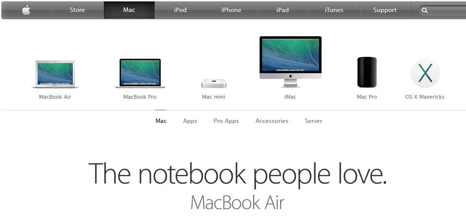
Leave it to the usability experts at Apple to lead the pack. Smallest, by far, of the three, Apple’s website doesn’t even include their nameplate–just their logo bug, the apple. Proudly standing-in for the home page navigation item, the Apple logo bug is just 19 pixels wide by 23 pixels high.
Small Logos are Beautiful
I’m sure you’re thinking small logos are fine for companies whose annual revenue rivals that of a small country’s GDP, but “not for my little company.” However, that’s precisely my point. Make your logo smaller, not larger, and you’ll appear more established and save a lot of room to get to your message–which is much more important.
Also, large logos don’t help visitors recognize your brand any better. Customers don’t care about your logo. They care about what you can do for them (the benefits). Focus on the benefits and stop asking your designer to “make the logo bigger.”
While you’re at it, make sure to educate them about white space…
Get the Email
Join 1000+ other subscribers. Only 1 digest email per month. We'll never share your address. Unsubscribe anytime. It won't hurt our feelings (much).
Discussion
Comments are now closed.